
Case study · Logo & Brand Identity
Game On Here
Sports Community App Brand & UI Design
Game On Here is a sports community app for players looking for a match, and it had to earn a place on a phone that already holds several. Brand and interface were drawn together so it would feel native to that row of icons rather than new to it.
01
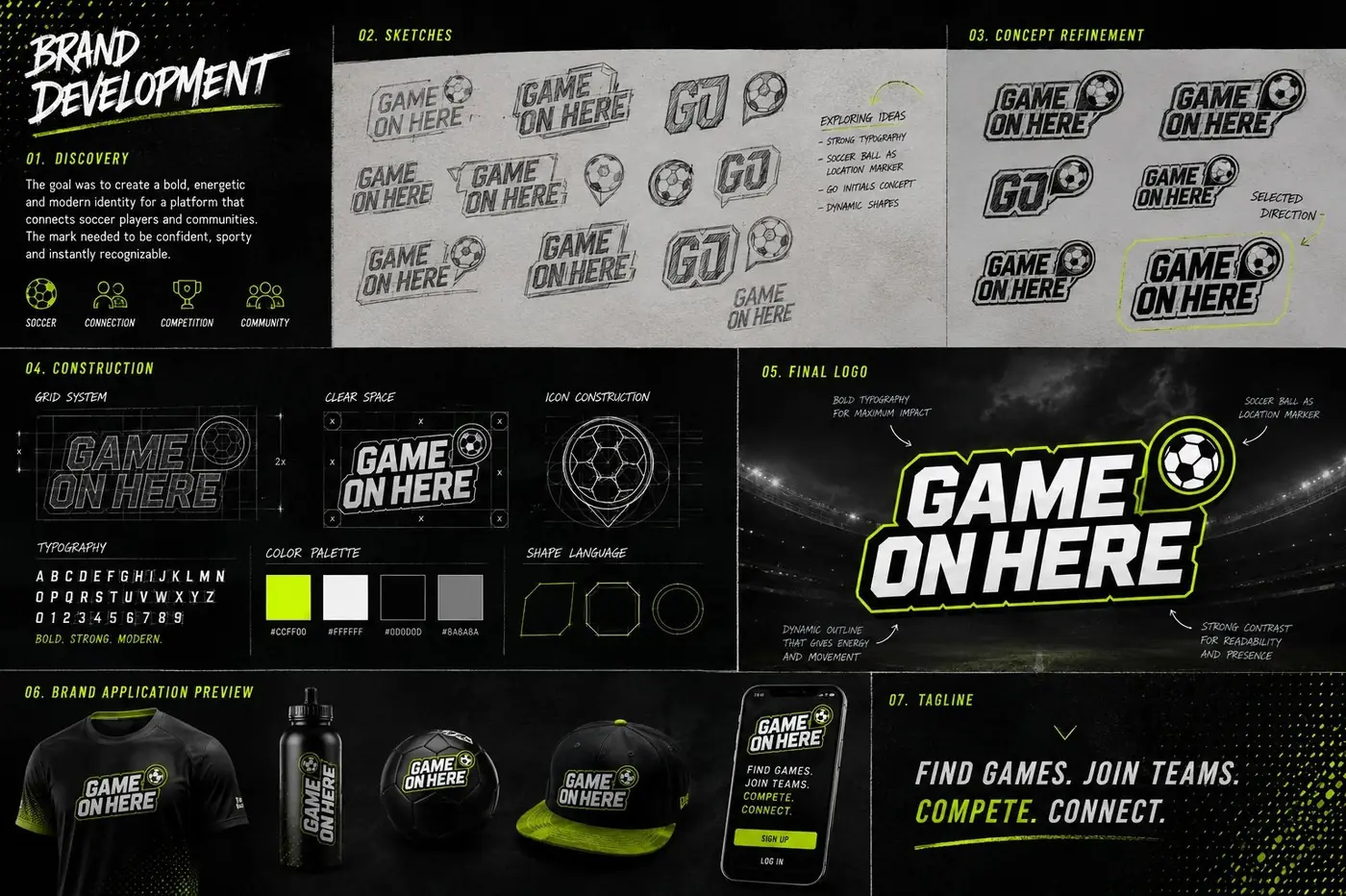
Drawn like a locker room sticker
An app brand competes in an unusual place. It sits on a home screen beside the league apps and score trackers a player already opens every week, and anything that looks like a tech company logo in that company reads immediately as the outsider. So the target was never distinctiveness for its own sake. It was belonging.
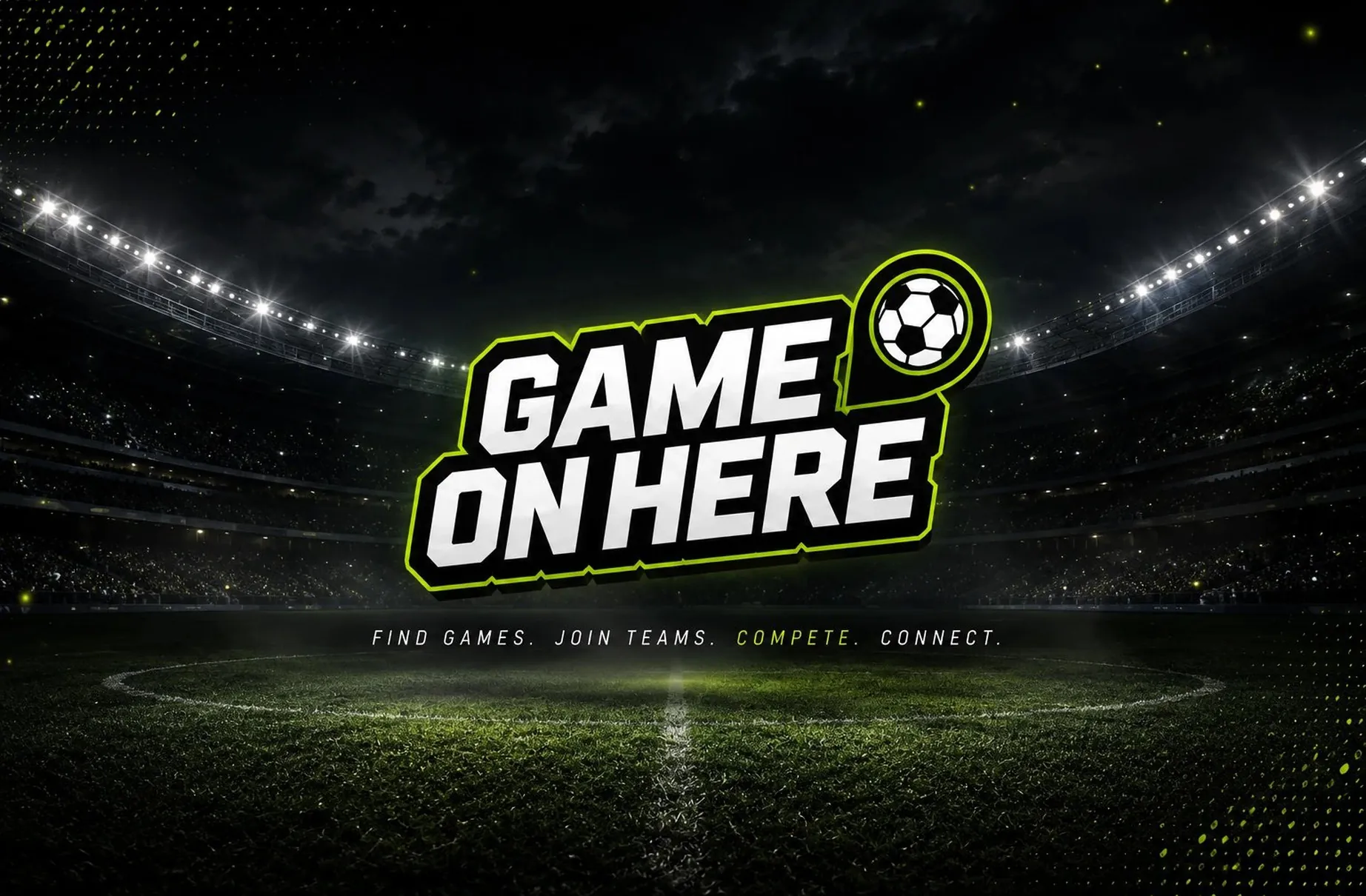
The wordmark is chunky and slightly raked, stacked in two lines with a heavy outline and a hard shadow, cut the way a sticker on a locker door or a water bottle gets cut. Lime on black carries sports energy without needing any explanation. The user here is a soccer player first and an app user second, and the mark takes his side of that.
The ball is the one piece of wit in the thing. It sits inside a shape that doubles as a location pin, which states the whole product in a single form: a game, and where it is. That is also why the mark can drop its wordmark entirely and still function as an icon.
02
The brand doing the interface work
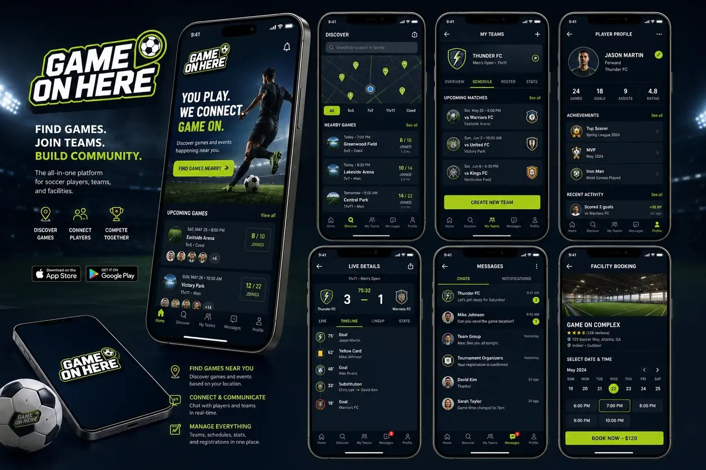
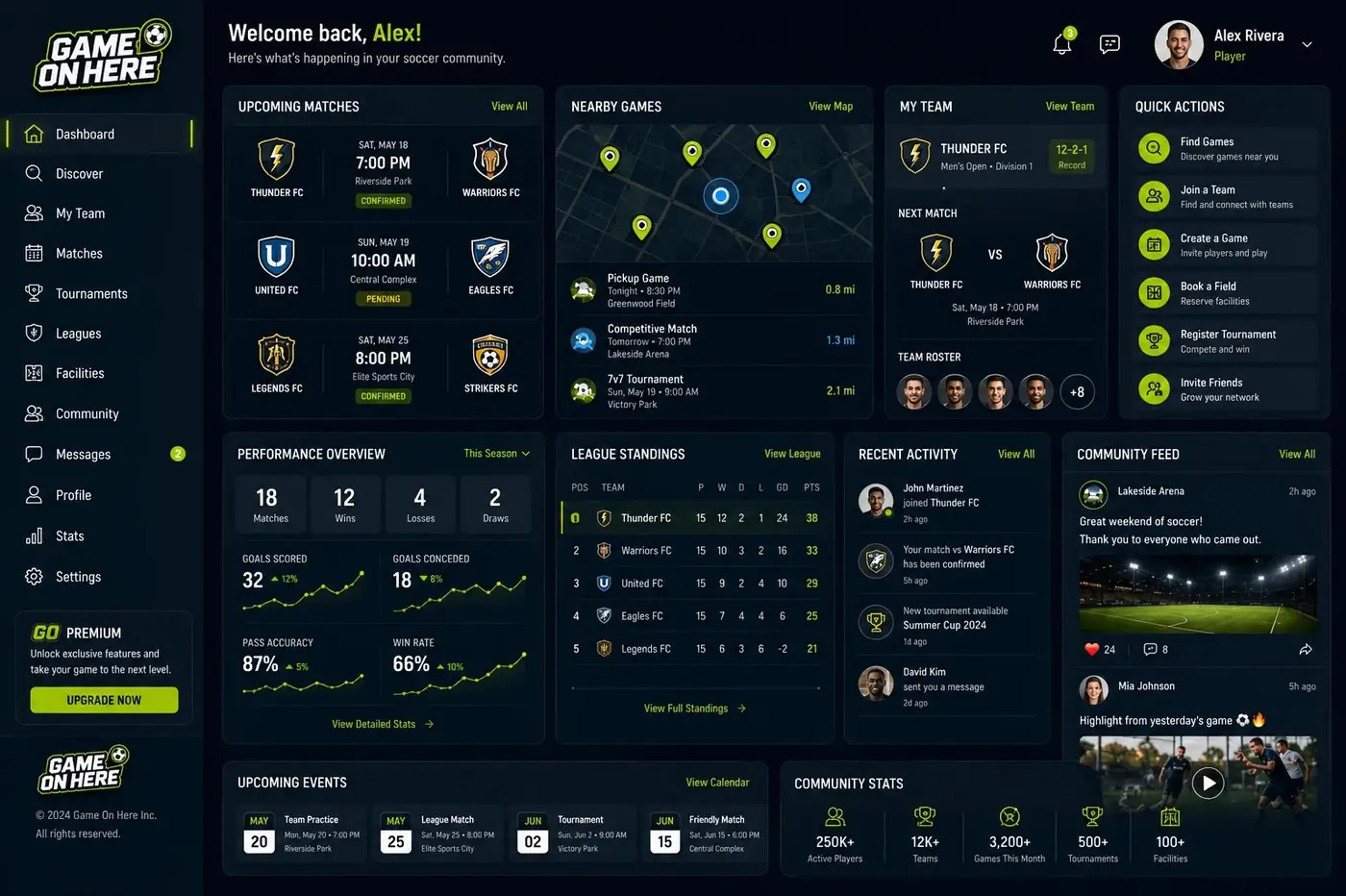
The screens were designed as one journey rather than a set of separate mockups. A player finds a match, looks over the team, follows it live, messages the group and books the field, and that is one continuous evening rather than five features. Building them in sequence gave the brand somewhere to go instead of somewhere to sit.
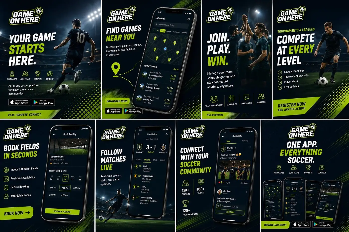
Lime stops being a color in there and becomes a signal. It marks the live state, the primary action, the next thing worth tapping, and almost nothing else, which gives a dark interface a dependable way to point. Black lets match photography sit in the screens with nothing fighting it, and the heavy type from the mark carries over as screen titles, so the logo never has to be pasted on top to prove whose app this is.
More work
More projects.




Have a project like this?
Tell me what you are building, changing or launching, and I will help you define the right scope and direction.