
Case study · Logo & Brand Identity
WrightWay
Emergency Services Restoration Fleet Brand Identity & Vehicle Wrap
WrightWay handles water, fire, storm and mold damage, and the call almost always comes from someone in the middle of a genuine emergency. The identity is built on one idea: show up already looking like the situation is under control.
01
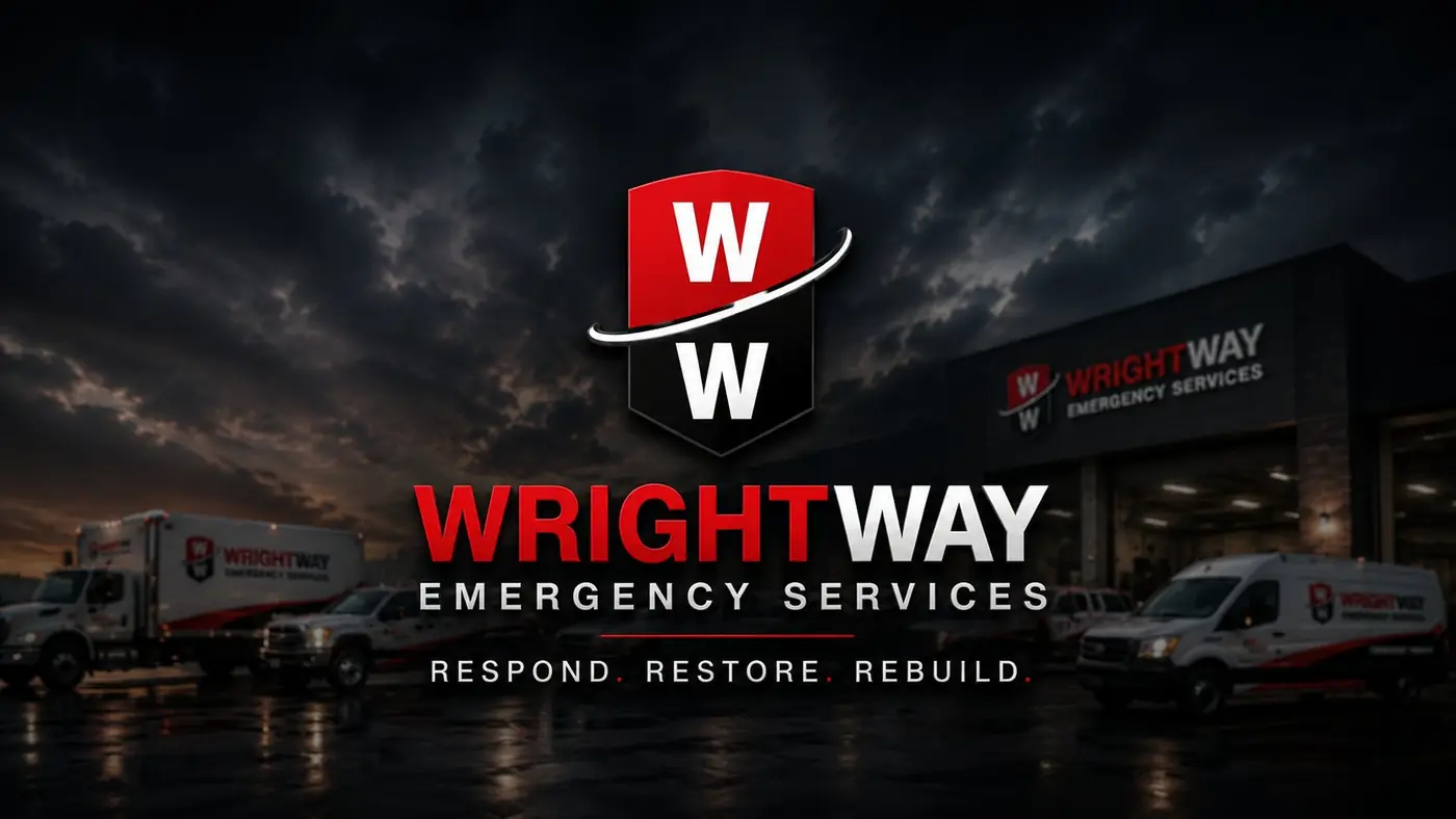
A shape that reads as protection
In an emergency nobody studies a logo. Someone sees a shape come up the driveway and decides, in about a second, whether this company can handle what has happened to their house. A shield answered that directly. It carries protection without a word of explanation, and it holds as a solid silhouette from a distance, which is the only way a mark gets read at the moment it actually matters.
Inside the shield the two W's stack, split by a white sweep that keeps the form from sitting heavy and static. I gave red the upper half and black the lower so urgency and steadiness arrive together instead of one canceling the other. The wordmark leans forward in a weighty sans, and the three part promise, respond, restore, rebuild, follows the job in the order a customer lives through it.
02
The whole fleet making one argument
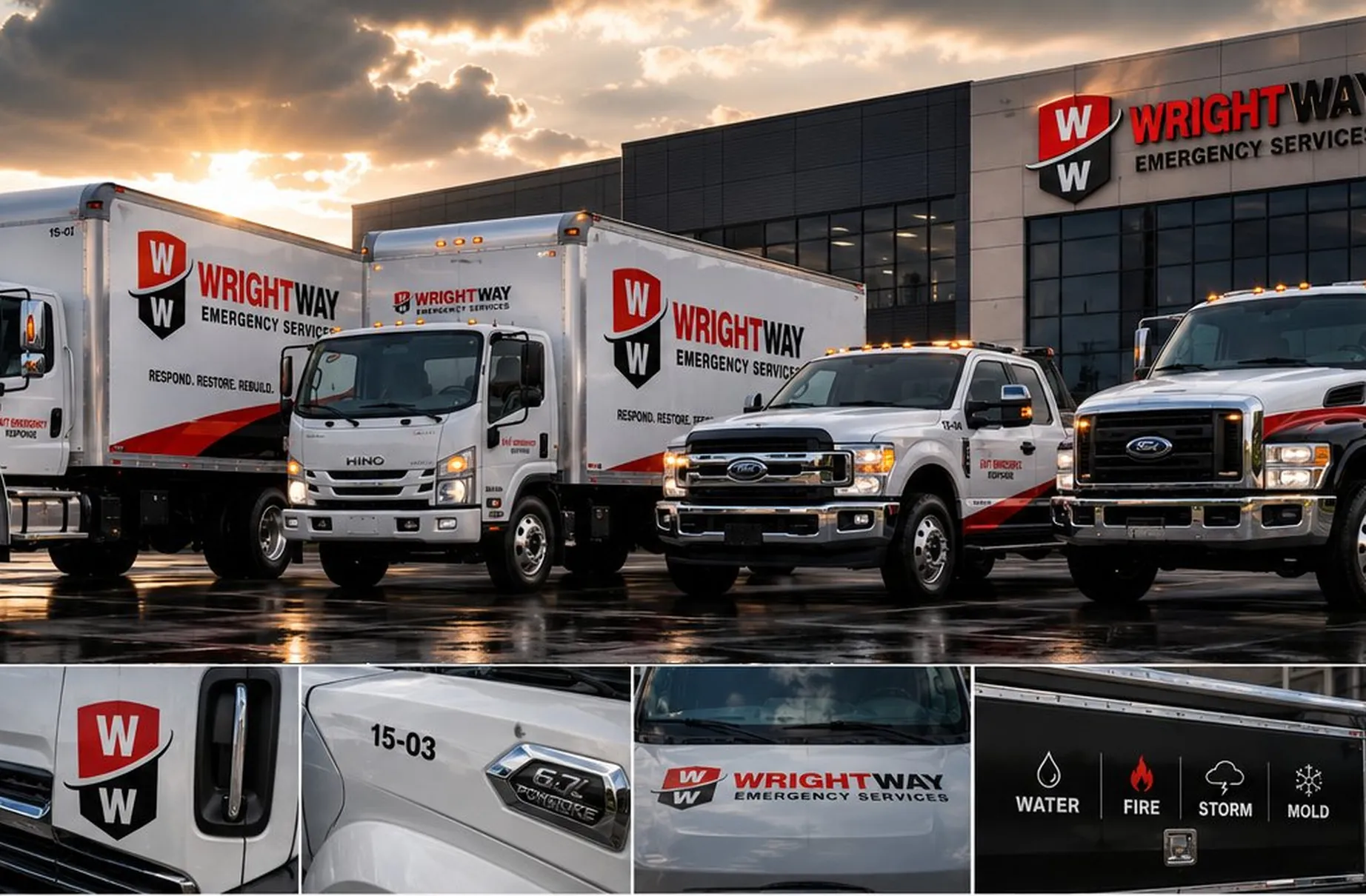
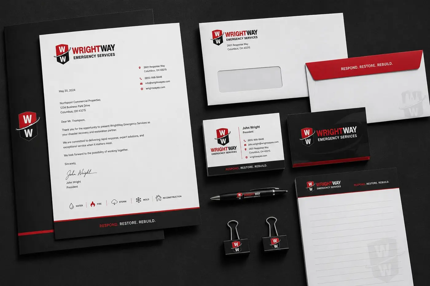
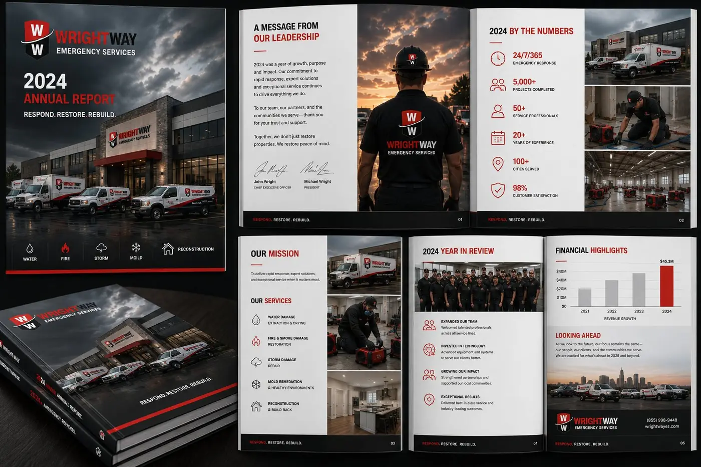
The real test of a mark like this is repetition. Fleet branding fails when every vehicle gets solved on its own, so the system runs on one red and black rule: the same shield, the same placement logic, the same forward angle on box trucks, on service pickups, on the sign over the door. Four matching vehicles pulling in together say something about how the company is run before anyone has spoken.
Scale was the other constraint. I wanted the shield to survive being stamped small beside a door handle and still hold its proportion, because a mark that only works large is a mark that quietly disappears on half the things it has to live on. The service categories run as a plain row of icons on a dark band, deliberately subordinate to the name, since a customer needs to recognize the company first and read the specialties second.
Unit numbers belong to the same discipline. They are set in the wordmark's own family rather than whatever the wrap shop had on hand, which sounds like a small thing until someone is trying to tell one truck from another across a crowded lot at six in the morning.
More work
More projects.




Have a project like this?
Tell me what you are building, changing or launching, and I will help you define the right scope and direction.