
Case study · Logo & Brand Identity
Bloom Bites Bliss
Fresh Avocado Brand & Packaging
Avocados are about as undifferentiated as produce gets, bought by squeeze rather than by name. Bloom Bites Bliss is built on the one thing a brand can win in that aisle, which is being remembered.
01
A visual pun does the remembering
Nobody stands in front of the avocados weighing brand values. They pick up two, press a thumb into each, and move on. That makes recall the entire job: the brand has to be the one a shopper can picture again next week, when they are back in the same spot doing the same thing with no label in front of them.
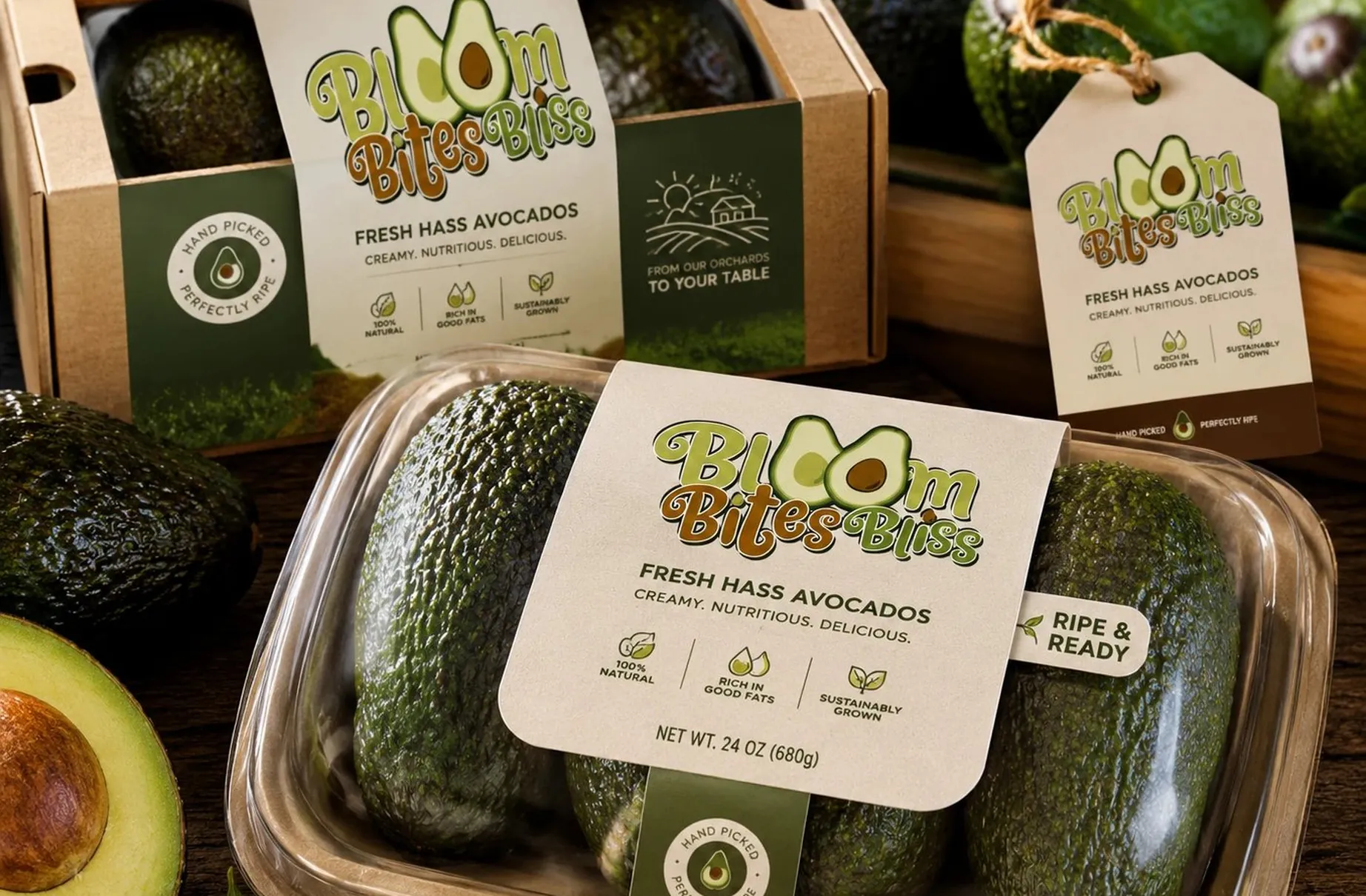
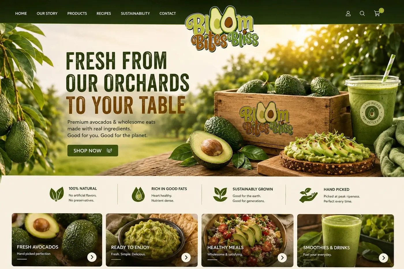
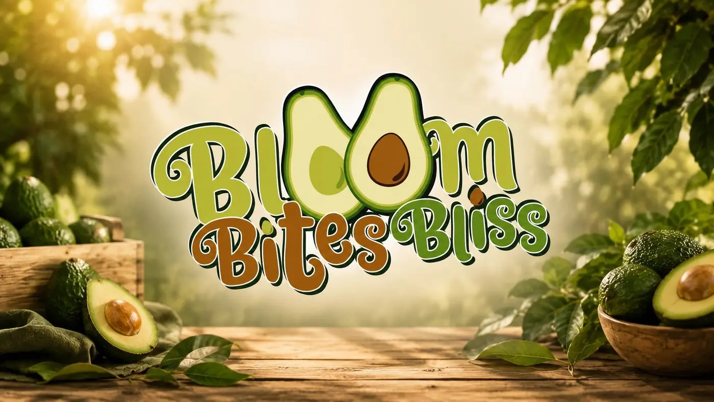
So the logotype carries the whole idea. The two o's in Bloom are drawn as avocado halves, one of them showing the pit, which is the kind of thing a person notices in passing and then repeats to somebody else. A pun like that is cheap in the best sense. It takes a second to land, it needs no explanation, and it does more recall work than a well set wordmark ever would here.
The lettering around it is rounded and hand drawn, shading from green into a warm brown that follows the fruit itself, and the whole thing sits on kraft with a deep green band beneath. I wanted the brand to look orchard grown rather than corporate, because a produce company that presents like a packaged goods company loses the one association it actually owns.
02
One label at every price point
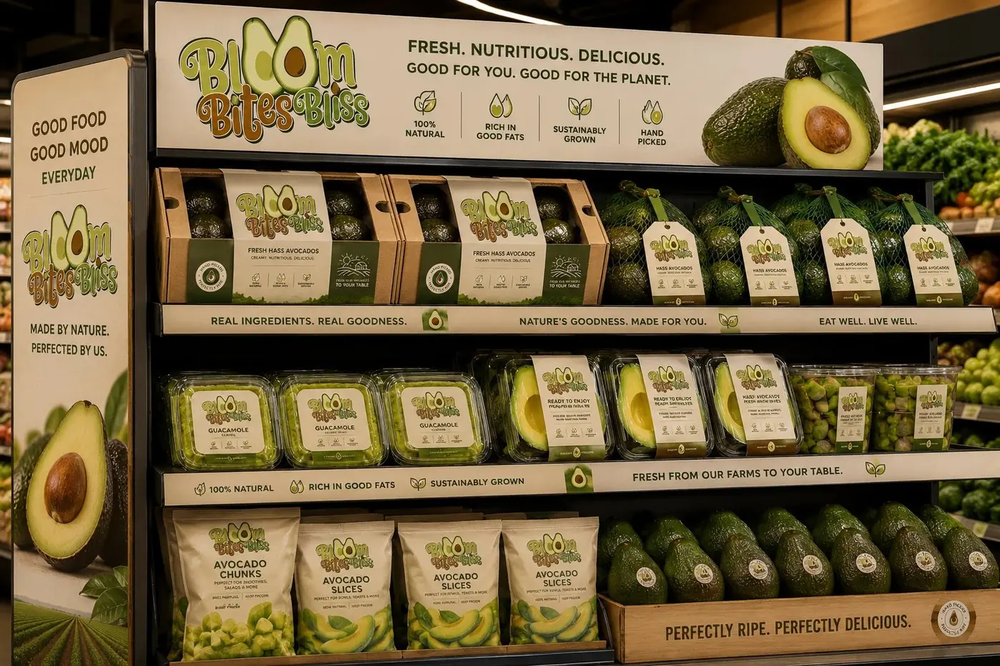
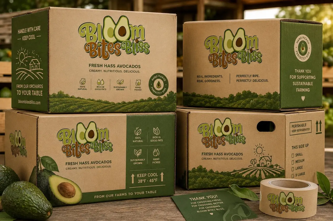
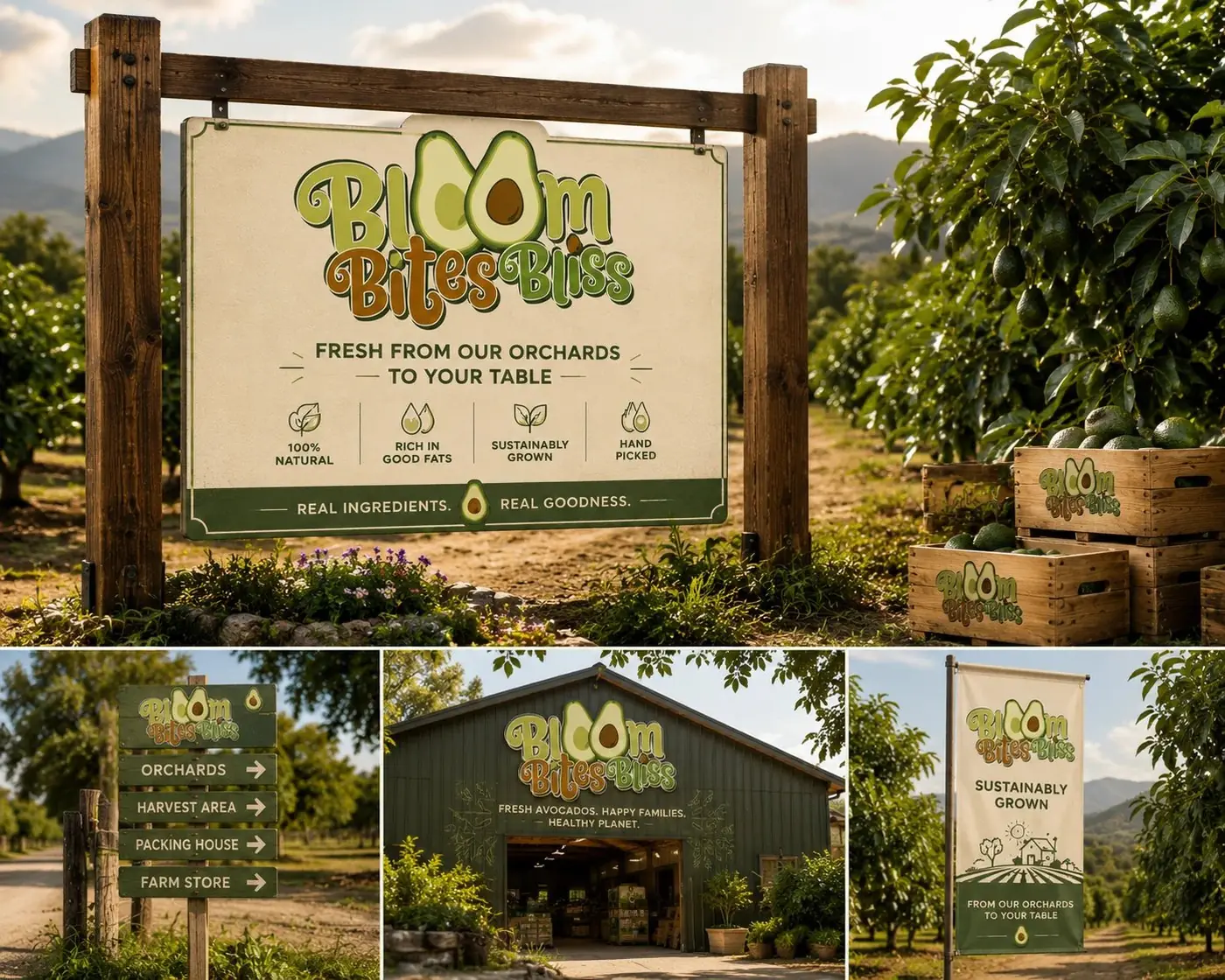
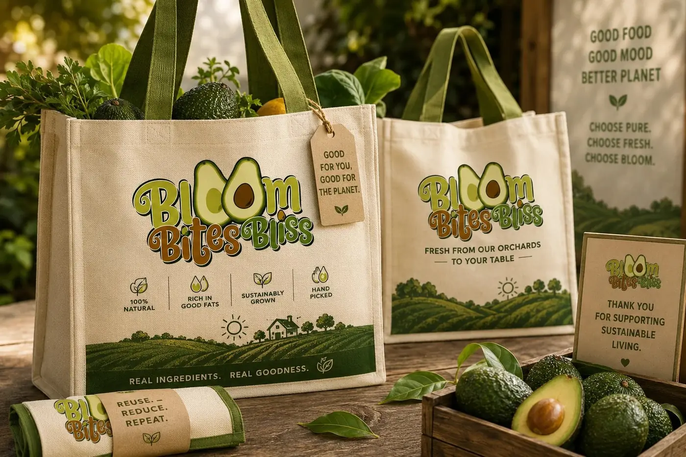
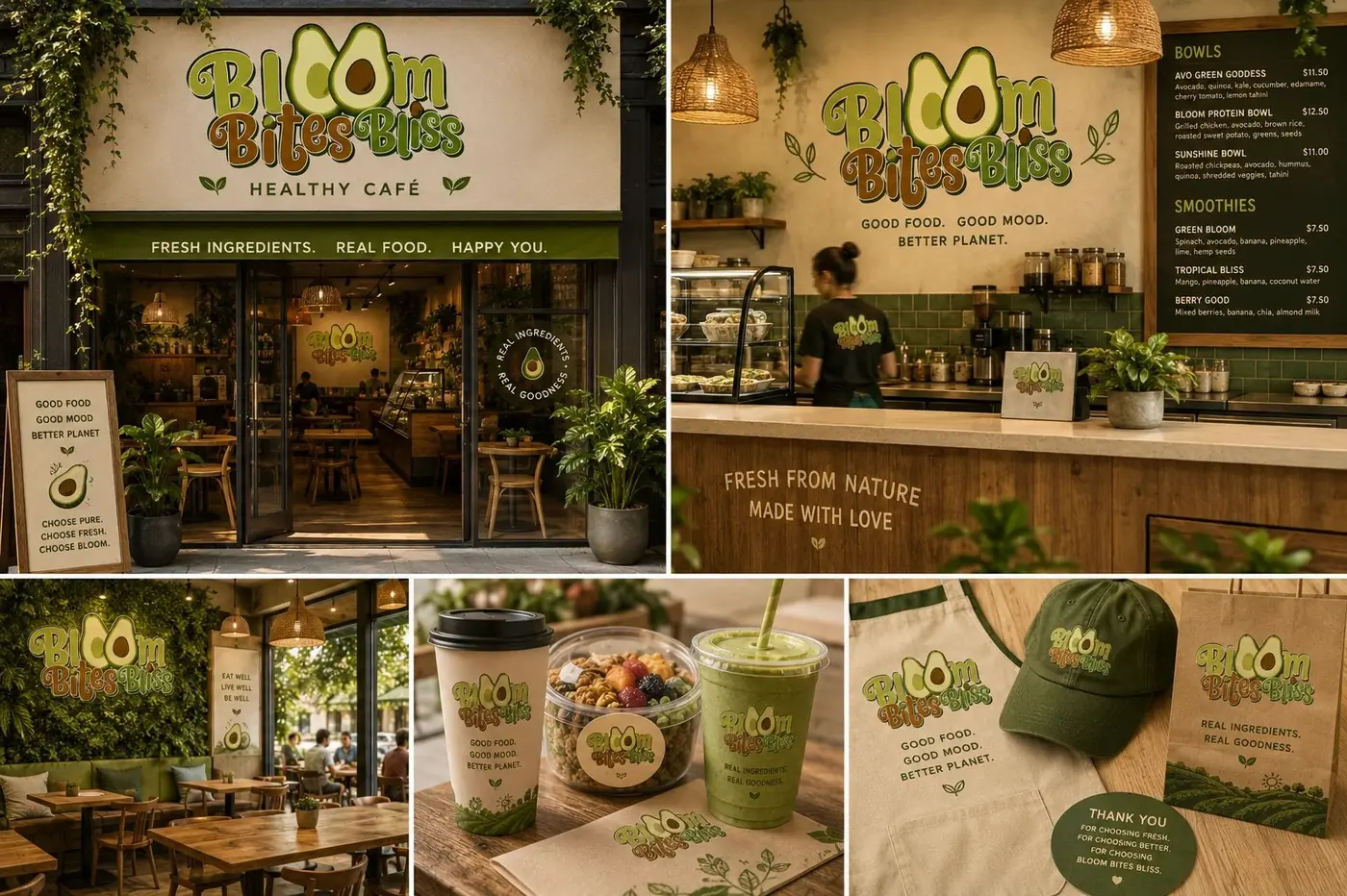
A retailer stocking this does not stock one thing. The same brand has to work on a gift box, on a tray a shopper picks up for the week, and on a tag no bigger than a business card, so the label was designed as a single arrangement that survives being scaled rather than as three separate solutions.
That discipline is why the halves in the logotype are outlined. At tag size, on kraft or against dark fruit, an unoutlined mark would fill in and the joke would go with it, which would cost the brand the only distinctive thing it has. The orchards to table line stays near the logotype on every format, so the story does not get left behind on whichever package happens to be the cheapest one.
More work
More projects.

Have a project like this?
Tell me what you are building, changing or launching, and I will help you define the right scope and direction.