
Case study · Logo & Brand Identity
BioGourmet
Organic Produce Brand Identity & Packaging
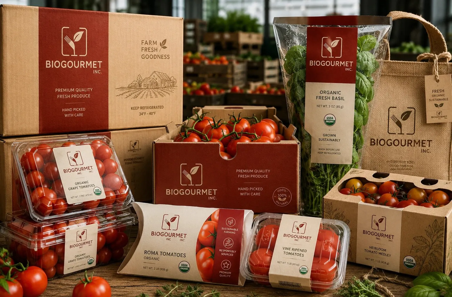
BioGourmet moves organic produce from wholesale crates to the clamshell a shopper picks up in the aisle. The identity had to survive that entire journey without ever looking like two different companies.
01
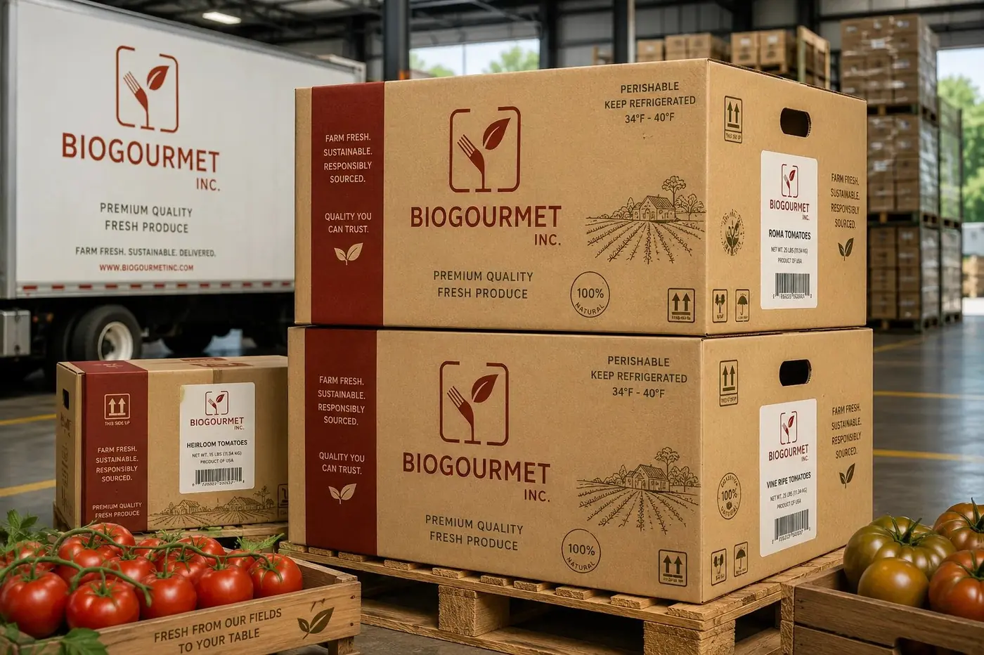
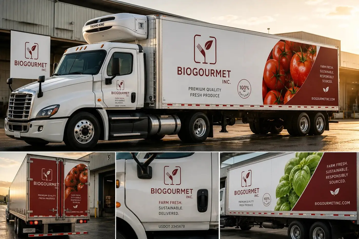
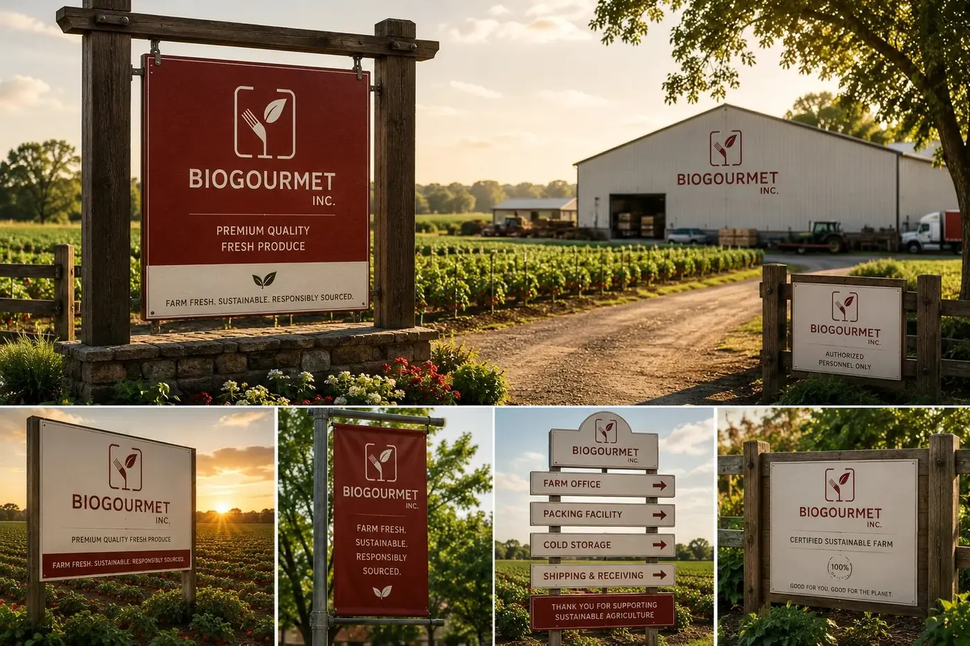
One company from crate to cart
Most produce brands are really designed for one end of the supply chain. The distributor gets a stenciled box, the shopper gets a pretty label, and nothing visible connects the two. That gap is where a brand quietly leaks its value, because the buyer placing the order and the person choosing dinner are asking the same question: has this food been handled by people who care about it.
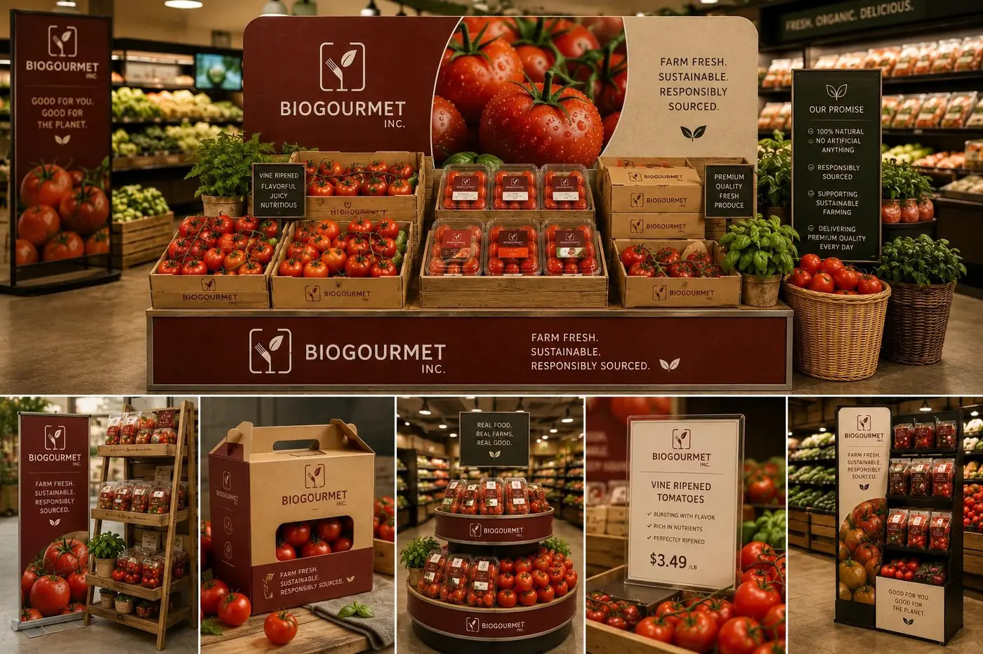
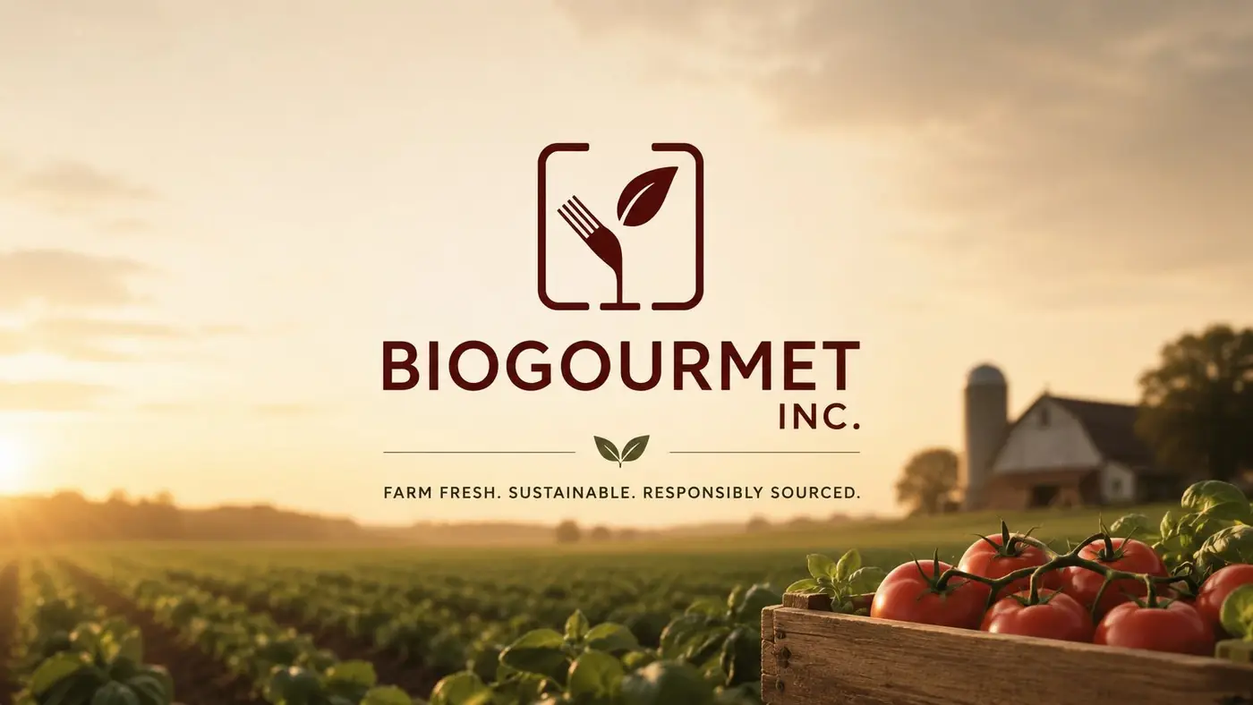
So the mark had to work as a small stamp on corrugated and as the front of a retail pack with equal conviction. A fork and a leaf, drawn in one weight and held inside a rounded square, does the explaining on its own. The fork says food, the leaf says organic, and together they arrive at farm fresh quality without a line of supporting copy underneath.
Deep red paired with kraft is what keeps it from reading as generic. Green is the reflex in this category, and reflex is another word for invisible, so I traded it for a color with warmth and appetite in it. Red carries the brand block, kraft carries the substrate, and the combination looks like something grown rather than something certified.
02
The discipline that holds a range together
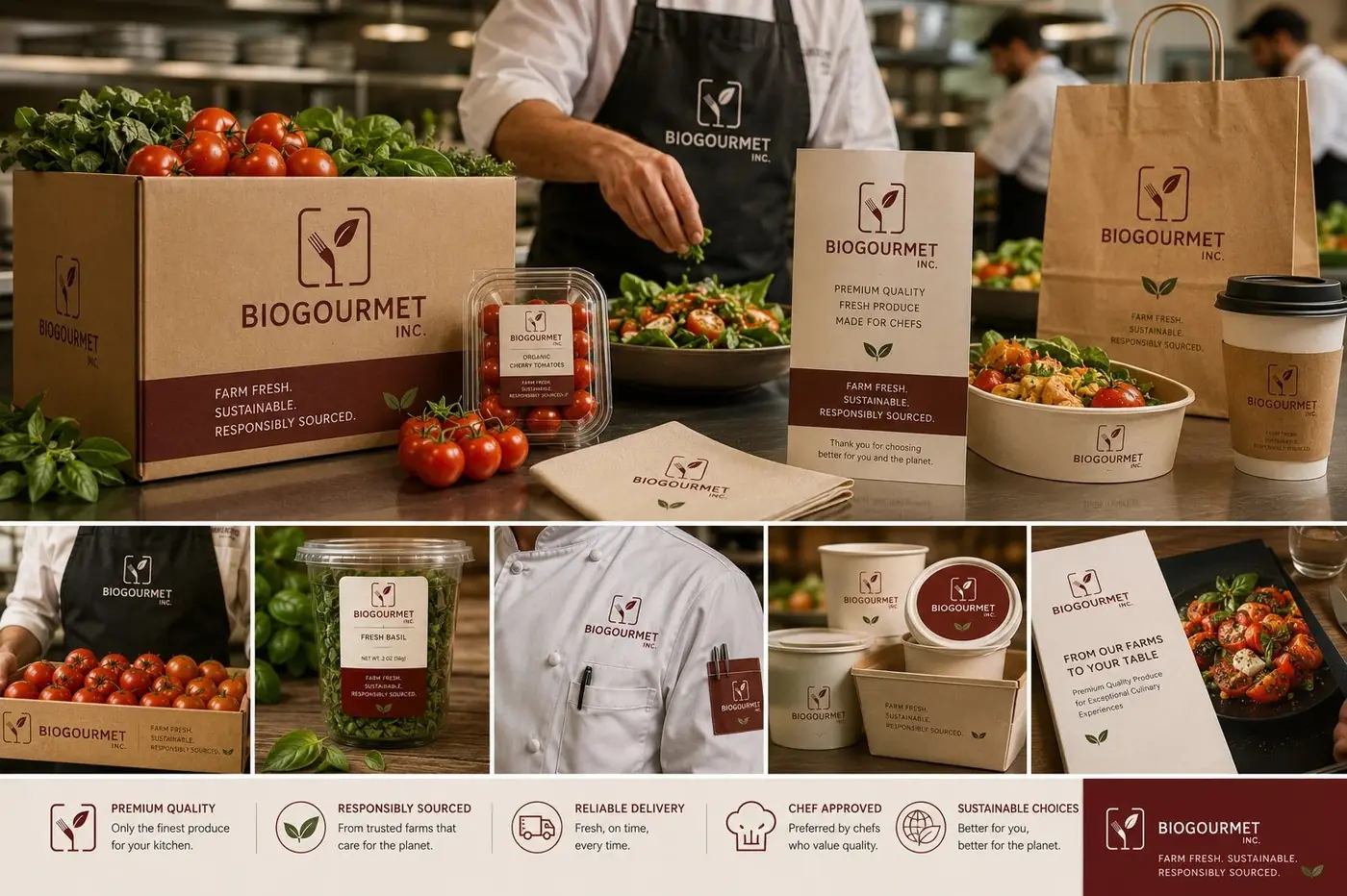
Certification placement is the quiet part of a system like this. The organic badge sits in exactly the same relationship to the name on every format, from a shipping box down to a herb sleeve, because a range where the badge floats looks assembled one pack at a time. Where it holds position, the whole line looks governed by a single standard, which is the impression a buyer is actually forming.
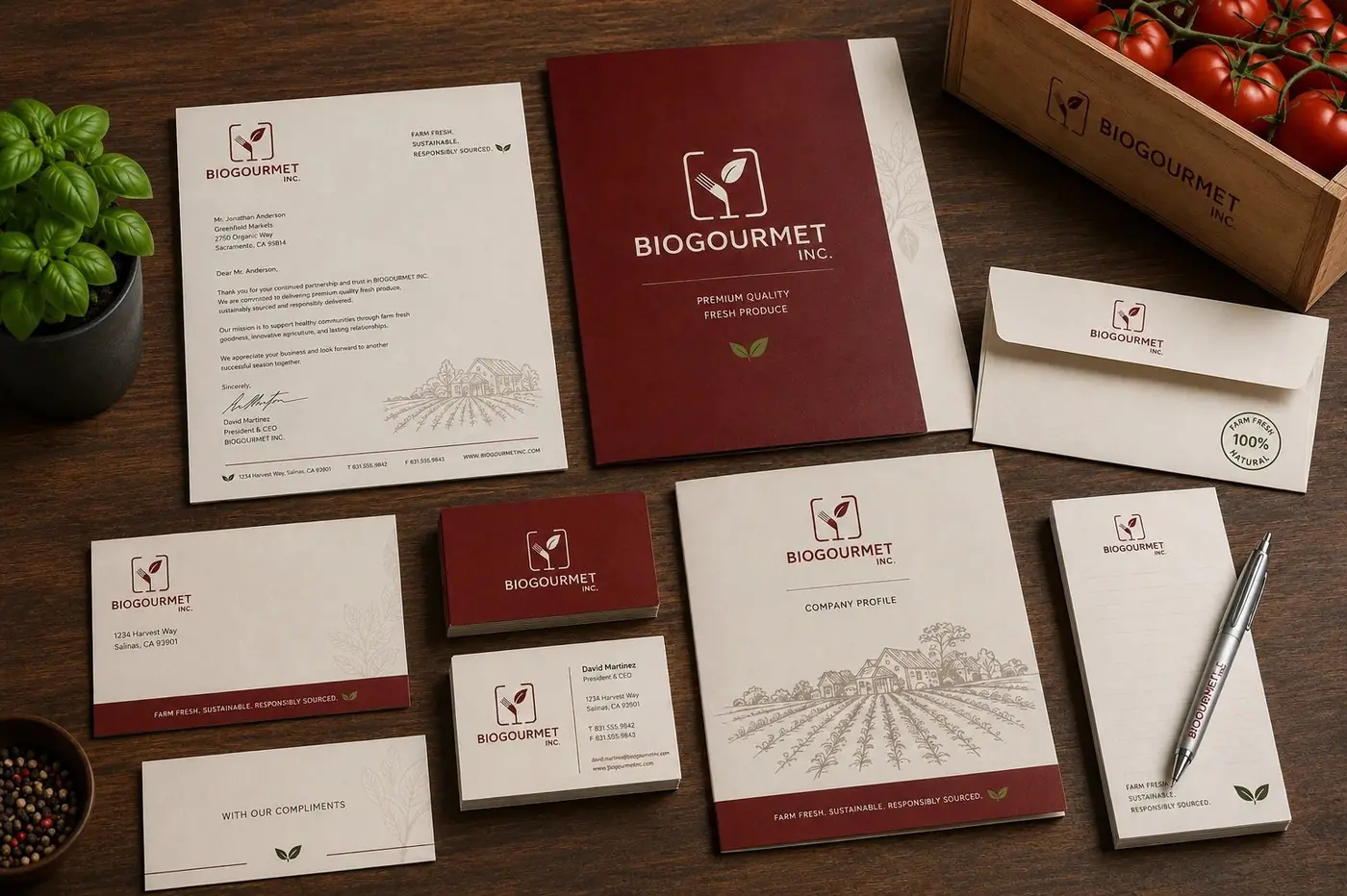
The rest travels with it. A plain line drawing of a farm and the hand picked with care line appear at the wholesale end as well as the retail end, which was deliberate. Someone unloading a pallet in a receiving bay should meet the same promise as someone standing in front of the shelf, and that consistency is most of what makes a produce brand feel like a company rather than a supplier.
More work
More projects.


Have a project like this?
Tell me what you are building, changing or launching, and I will help you define the right scope and direction.