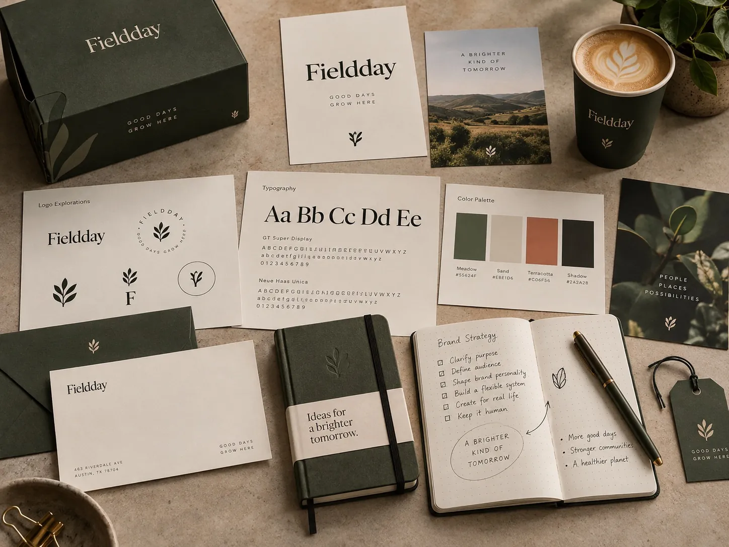
Building a Brand System Instead of Just a Logo
A logo can launch a business. A system is what allows the business to keep communicating as it grows.

Why should a company build a brand system instead of only a logo?
A logo answers one question: who is this. A brand system answers every question that comes after it. Which typeface, in which role. Which color leads and which supports. How the mark sits on a truck, a package, a slide, a sign. Without those answers, each new piece becomes a fresh design decision made by whoever is closest to the deadline, and the company slowly splinters into several companies wearing the same badge. The system is what lets other people produce work that still looks like you.
Approval day is when the work starts
There is a particular quiet that follows a logo approval. Everyone is happy, the files go out, and for about two weeks the problem feels solved. Then the questions start arriving, one at a time, from different directions.
The sales team needs a proposal template. The website needs headline typography and a point of view about photography. The trade show booth needs the mark at four feet wide and the same mark embroidered at one inch. A second product launches and needs to sit beside the first without looking like a different company made it. Nobody planned for these. They simply show up, because a business generates communication whether or not anyone designed a way to do it.
A logo cannot answer any of them. It was never built to. It is one drawing with one job, and the moment the company needs to say something longer than its own name, the drawing runs out of road. I have watched this happen often enough that I now treat the approval meeting as a beginning rather than a delivery. What I am really handing over at that point is the first component of something that is not finished yet.
What a system actually contains
When I say system, I do not mean a hundred page manual nobody opens. I mean a small, deliberate set of ingredients and a short set of rules about how they behave together.
The ingredients are usually the same categories: typography, color, graphic devices, image style, and composition. Typography does more identity work than most people expect, because text is the majority of what a company puts into the world. Color needs a hierarchy, not just a palette: one color that leads, one or two that support, and a rule for when the accent is allowed to appear. Graphic devices are the repeatable shapes, rules, frames or patterns that let a layout feel branded when the logo is small or absent. Image style is a decision about what the company’s photographs look like, which is a decision most brands make by accident.
The rules are about relationships. How large the logo sits relative to the headline. How much clear space it keeps. How a product name is written next to the company name. Whether headlines align left or center. These sound trivial written down. In practice they are the difference between a brand that holds together across fifty pieces and one that holds together across five.
The test of the ingredient list is simple. Cover the logo. If the piece is still recognizably yours, you have a system. If it becomes generic, you have a logo and a lot of loose decisions.
Recognition does not depend on the mark
Most of the moments where a brand is perceived are moments where the logo is a small element or not present at all. Someone scrolls past a social post. Someone sees a van at an intersection for two seconds. Someone opens a proposal on a phone. Someone reads the back panel of a package to check an ingredient.
In every one of those, the recognizable thing is the combination of type, color, spacing and image style, not the mark. This is the part that surprises clients, and it is also the part that makes the system worth paying for. A mark alone gives you one recognizable object. A system gives you a language you can speak in a hundred situations you have not designed yet.
For Waypoint, a healthcare solutions brand, the identity work included a wayfinding system, and that is a useful example of the distinction. Wayfinding is almost entirely typography, color coding, arrow logic and consistent placement. The logo appears, but it is not what makes a corridor legible. The rules are.
I have written more about how this compounds over time in brand consistency is a growth strategy, and about where the boundary sits between the two ideas in a logo is not a brand.
Flexibility is the point, not uniformity
There is a bad version of consistency where every piece looks identical and the brand becomes visually monotonous. That is not what a system is for. A corporate announcement should not look like a summer campaign, and neither should look like a package. All three should feel related.
So the useful question is not how do we make everything the same. It is which elements stay fixed and which are allowed to move. Usually the mark, the primary typeface and the core color relationship stay fixed. Layout density, secondary palette, image treatment and graphic device can flex by context. Deciding this explicitly is what gives a brand range without chaos.
A system built only for one channel fails the first time the company enters a second one. I see this most often with brands designed entirely for a website, which then have to produce something physical and discover the palette was never built for print, or the typeface was licensed for web only, or the logo has no version that works in a single color.
Range gets tested fast. A brand like Florida Cool, doing HVAC service calls, has to work on a van moving at speed, on a uniform, on an invoice and on a yard sign. Those are four different physical problems. One drawing does not solve them. A set of rules about scale, contrast and placement does.
The system is what reduces dependence on me
This is the part I care about most, and it is the part clients rarely ask for by name.
A successful identity has to keep working when the company produces material without the person who designed it. An internal marketing hire, a printer, a web developer, a packaging vendor, a sales manager building a deck at eleven at night. If every one of those people has to guess, the brand degrades in small increments that nobody notices individually and everybody notices a year later.
Clear guidelines and well structured files transfer the creative logic out of my head and into the organization. That means correctly built logo variants rather than one file everyone stretches, a defined type scale rather than a favorite font, templates for the pieces the company makes most often, and short written reasoning for the rules that are easy to break by accident.
If the identity only looks coherent when I am personally arranging every page, it is not a system. It is a dependency, and I do not think that is a good thing to sell. For Lane Law Office the stationery system mattered more than any single application, because stationery is exactly the kind of material a company produces repeatedly, for years, without calling a designer.
What a logo only approach costs
Picture a service company with five trucks, good crews and a solid local reputation. They commission a mark. It is well drawn and everyone likes it.
Then reality arrives in pieces. The wrap needs a layout, so the wrap shop invents one and adds a gradient the mark was never designed for. The shirt needs a small one color version, so somebody stretches the horizontal file. The invoice needs a typeface, so it uses whatever was already installed. The yard sign needs a color that reads at fifty feet, so it uses a brighter version of the brand color. The website uses stock photography with no relationship to any of it.
Every one of those decisions was reasonable in isolation. Together they produce a company that looks like five companies, and the owner usually concludes that the logo was the problem. It was not. The missing piece was the layer between the mark and the applications.
The cost is not only visual. It is time. Every piece takes longer because nothing is decided in advance. A system reverses that: work gets faster and cheaper as it accumulates, because a new sell sheet becomes an assembly job rather than a design project.
Build it in the order the business needs
You do not need everything on day one, and pretending otherwise is how guidelines projects stall.
Start by listing what the company actually produces in a normal year, in order of frequency. For most businesses that list is shorter than expected: proposals, invoices, the website, one or two social formats, a vehicle or a storefront, packaging if they sell product, a deck. Design the rules against that real list, not against a hypothetical brand universe.
Then build in three layers. First the fixed core: logo variants, type scale, color hierarchy, clear space. Second the components: the four or five pieces the company makes most, built as usable templates. Third the reasoning: a short document explaining what can flex and why, written for someone who is not a designer.
The order matters because the identity should be pressure tested against real applications before it is codified. When I worked on CareerLabs, a program identity for the Boys and Girls Clubs of Boston, the environment was part of the brief, so the system had to prove itself at wall scale and not only on screen. Designing the rules and the applications together is what keeps a system honest, and it is the approach I take in brand identity projects generally. It also depends on knowing what the brand is for before drawing anything, which is the argument in why strategy comes before design.
What to check this week
Open the last ten things your company published. Put them side by side on one screen. Count the typefaces. Count the distinct versions of your primary color. Look at how the logo is sized and positioned in each one.
Then cover the logo on all ten and ask whether a stranger would group them as one company. If the answer is no, the gap is not in the mark. It is in the layer above it.
Next, ask who made each of those ten pieces. If more than two people were involved and nobody had a written rule to follow, you have found the mechanism, not just the symptom. And finally, try to produce one new piece using only what is documented today. Whatever you have to invent in order to finish is exactly the part of the system that does not exist yet, and that list is the brief for building it.
Key points
- A logo identifies the company, while a system is what lets the company keep communicating consistently across channels it has not designed yet.
- Recognition usually comes from typography, color, spacing and image style rather than from the mark itself, because most brand moments show the logo small or not at all.
- Consistency means deciding which elements stay fixed and which are allowed to flex by context, not making every application identical.
- A system succeeds when internal teams and outside vendors can produce on brand work without the original designer being involved.
- Build the rules against the pieces the business actually produces most often, and test them on real applications before writing them down.