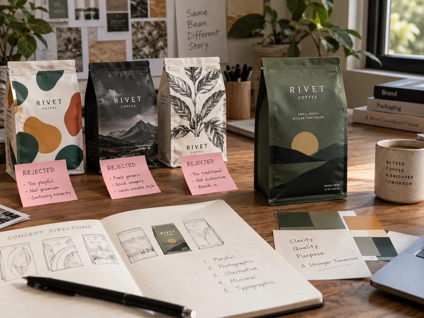
Why We Chose This Packaging Direction
A packaging direction should win because it solves the right problem, not because it is the most decorative concept in the presentation.

How should a packaging direction be chosen?
Judge each concept as a complete strategic idea rather than as a collection of parts. The question is not which option contains the most attractive individual elements, it is which direction gives the product the strongest position and the most useful system. That means going back to the business problem the package has to solve, testing each concept at real size beside real competitors and at thumbnail scale, checking whether it can absorb future products without fragmenting, and separating what the core design does from what special finishes add. Excitement matters, but it is not the criterion.
Why concept reviews turn subjective so fast
The moment several directions go up on a screen, the conversation has a natural pull toward preference. One person likes the color in option one. Someone else prefers the type in option three. A third person wants the illustration from two applied to the layout from one. Within twenty minutes the team is assembling a hybrid, and every direction has lost the internal logic that made it coherent.
This is not a failure of the people in the room. It is what happens when a group is handed visual material and no criteria. Humans have instant reactions to images and slow reactions to strategy, so in the absence of an agreed question, everyone answers the only question they can answer immediately, which is whether they like it.
The fix is to establish the criteria before anything is shown. If the room has agreed in advance that the main problem is weak differentiation in a crowded category, or that the range needs to look manufactured rather than assembled, then the discussion has something to measure against. Preference does not disappear, but it stops being the only available language, which is the practical version of the idea that every design decision needs a business reason.
Start with the job the package does
Before any aesthetic judgment, I go back to the problem. Does this product need to feel more premium, or more credible, or more modern? Does it need stronger recognition from across an aisle, or clearer separation from a specific competitor, or a structure that finally makes the variants easy to tell apart? These are different problems and they produce genuinely different designs.
Naming the main objective is harder than it sounds because most companies have several and would like all of them. The discipline is to rank rather than to list. If premium feel and shelf visibility conflict, which one wins? If clarity and distinctiveness pull apart, which matters more in your category right now? Answering that in advance is what allows a decision later.
There is also usually a second job nobody says out loud. Packaging often has to work internally: convincing a retail buyer, supporting a price increase, making a sales conversation easier, signaling to a distributor that the company is serious. Those are legitimate objectives and they change the brief. It is better to state them than to have them appear as unexplained resistance to an otherwise good concept.
Judge complete ideas, not parts
A concept is a set of decisions that support each other. The color choice makes sense because of the type choice, the type choice makes sense because of the hierarchy, the hierarchy makes sense because of the position the product is taking. Pull one element out and drop it into a different concept and you usually break both, because the relationships were the actual work.
This is why I resist mixing rounds. It is not precious about the design, it is practical: hybrids tend to be weaker than either parent because nobody rebuilt the relationships. If a specific element from a rejected direction is genuinely better, the right move is to take it back and rebuild the chosen direction around it deliberately, not to paste it in during a meeting.
Presenting fewer, more complete directions helps. Three concepts that each commit to a clear position produce a real decision. Six variations that hedge produce a shopping trip. I would rather show three and explain what each one gives up, because what a direction sacrifices is often more revealing than what it includes, which is the whole reason I write up why we rejected three concepts rather than only presenting the winner.
Test the concept in the real environment
A package can look excellent as a large isolated render and fail completely at actual size. The presentation is the least realistic viewing condition a design will ever face: perfect lighting, no neighbors, no distraction, and a viewer who has been told what to look at. Almost nothing about a store or a search results page resembles that.
So I move the comps into conditions that are closer to reality before a decision is made. Print at actual size. Put the product beside its real competitors, not beside a generic gray box. Look at it from six or eight feet. Reduce it to the size it will appear as a listing thumbnail on a phone. Photograph it under ordinary light rather than studio light. Each of these tests removes an advantage the presentation was giving it.
The results reorder the options more often than people expect. A direction that everyone admired at full size can vanish at thumbnail scale. A direction that seemed plain can turn out to be the only one that holds its identity from a distance. Doing this before the decision costs an afternoon. Doing it after the print run costs a print run.
Ask whether the system can grow
The chosen direction should not be a one package trick. Most brands do not stay at one product, and the difference between a design and a system is whether it has rules: what governs color across variants, how the product type is stated, where the strength or scent name sits, what stays fixed and what is allowed to change when the fourth item arrives.
I stress test this by inventing future products during the selection. If this company launches three more flavors next year, does the direction absorb them and look stronger, or does it start to fragment? If a refill format, a travel size and a professional size get added, is there room for them in the hierarchy? A direction that only works with the products that exist today is a liability disguised as a design.
Professional categories make this visible fastest because the ranges are large. A system like Itallian Color and Oxi has to keep a long line of shades reading as one coherent family while still letting a stylist find a specific number quickly. That is not achieved by decorating each unit well. It is achieved by rules that were decided before the first unit was finalized, which is the same argument as building a brand system instead of just a logo.
Separate production value from decorative value
Special finishes can lift a concept considerably. Foil, embossing, soft touch coating, a heavier board, an unusual closure. All of them are real tools and I use them. The question during selection is whether the concept works before they are applied, because a direction that only holds together because of a finish is fragile in several ways at once.
Finishes are the first thing cut when a cost estimate comes back high, and cost estimates frequently come back high. If the idea lives in the foil, then the value engineering conversation is not a trim, it is a collapse. I want a direction that is still clearly the best option in flat print, so that any finish we add is amplification rather than rescue.
There is also a channel argument. A soft touch coating is persuasive in the hand and close to invisible in a photograph, and reflective foils can actually be harder to shoot well. If most of the volume is online, spending heavily on effects that only exist in physical handling should be a conscious decision rather than an inherited habit. Where the money goes matters more than how much of it there is.
Consider what the direction costs to run
Selection conversations usually focus on the launch and ignore the following three years, which is where most of the cost actually sits. Some directions are cheap to extend and some are expensive. A system built around commissioned illustration for every variant carries a recurring bill and a dependency on one illustrator’s availability. A system built around a typographic structure and a color logic can be extended by anyone competent.
Print reality belongs in this conversation too. A design that needs a fifth spot color, tight registration across a fold, or a substrate available from one supplier is a design that will be harder to reproduce consistently across suppliers and runs. That is fine if the payoff is large and the category justifies it. It is not fine if the same effect was available with fewer moving parts.
Refill and secondary formats deserve a check as well. A bleaching powder refill system has to carry the same identity onto a very different package shape and a different price expectation, and a direction that assumed one format tends to strain at that point. Asking how the idea behaves on its least glamorous format is a fast way to find out whether it is a system or a poster.
The role of the client’s taste
None of this makes taste irrelevant, and I am wary of designers who treat a client’s reaction as noise. The people who run a company know things about their customers, their buyers and their category that no research summary captures. When a founder says a direction feels wrong for their audience, that reaction is data, even when the reasoning behind it is unclear.
What I try to separate is taste about the direction and taste about details. Detail preferences can usually be accommodated inside any of the concepts. Direction level discomfort is worth slowing down for, because launching something the company does not believe in produces inconsistent application later, and inconsistent application will undo the design faster than a weaker choice would have.
The exception is when a preference conflicts directly with the stated objective. If the agreed problem is that the product looks cheaper than it is, and the preferred direction is the one that tests weakest on premium cues, that conflict needs to be named rather than absorbed. My job is to make the trade off visible and then let the person who owns the business decide, because they carry the consequence.
How to run your next concept review
Write the criteria down before the presentation and share them. Three or four lines is enough: the main business objective, the secondary objective, the constraint that is not negotiable, and the audience the decision is being made for. Ask everyone in the room to judge against those, and to state which criterion they are using when they give an opinion. This one habit changes the quality of the conversation more than anything else I do.
Then require three physical tests before any vote. Actual size print, viewed from six feet beside real competitors. Thumbnail size on a phone in a grid. And a sketch of the range twelve months from now with two or three products that do not exist yet. Any direction that fails one of these has told you something you needed to know, and you now know it for free.
Finally, ask what happens to each direction when the budget tightens. Strip every special finish and look again. Ask what it costs to add the next variant and who has to be available to do it. The direction that survives all of that is the one most likely to become a durable commercial asset rather than a launch that needs replacing in two years, and that is the standard I hold the work to in packaging design engagements.
Key points
- Concept reviews turn subjective when criteria are not agreed before the work is shown, so the criteria should come first.
- Directions should be judged as complete ideas, because mixing elements between them usually breaks the relationships that made each one work.
- Testing at actual size beside real competitors and at thumbnail scale reorders the options more often than teams expect.
- A direction that cannot absorb future products without fragmenting is a liability, however well it presents today.
- The core design has to be strong in flat print, so that special finishes amplify the idea rather than create it.
- The long term cost of running a system, in print complexity and recurring production, belongs in the selection decision.