Designing Beyond Aesthetics
The visual result matters, and the thinking that decides what the result has to accomplish matters more.

What does it mean to design beyond aesthetics?
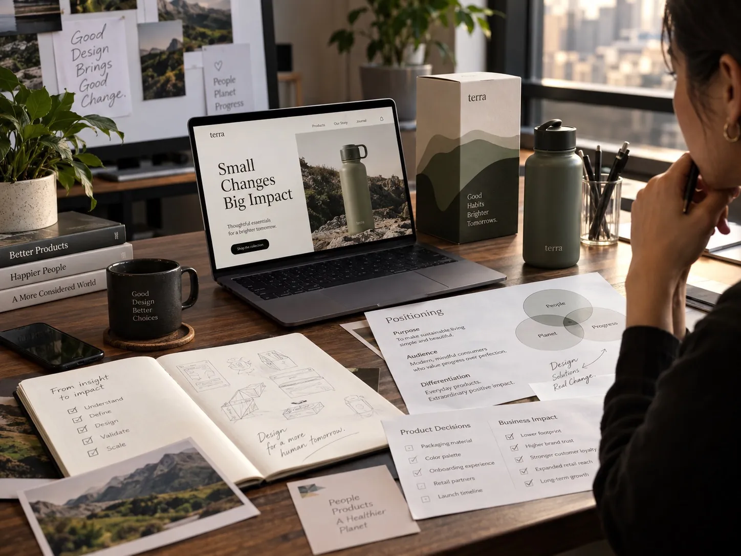
It means making the work look right because it is solving the right problem, rather than hoping a refined surface will be enough on its own. I care about craft, and craft alone cannot justify a decision. Designing beyond aesthetics means weighing the audience, the competitive environment, the production constraints, the growth plans and the ordinary places the design will actually live, then choosing a visual language that supports a specific position. The test is not the presentation. It is whether the work still performs a year later, in normal conditions, in other people’s hands.
Aesthetics matter, but that is not the argument
I want the work to be beautiful. I want the spacing to be right, the curve of a letterform to feel deliberate, the material to be pleasant in the hand and the whole thing to look like it came from a company that takes itself seriously. After more than 25 years of doing this, craft is not something I am willing to treat as optional, and I do not think a strategically correct piece of work that looks amateur is correct at all.
What I will not do is defend a decision only by saying it looks good. That sentence ends a conversation instead of opening one, and it leaves the client with nothing to push against. If the only reason a mark is drawn this way is that I liked it, then the next person with a different taste has an equally strong claim, and the brand becomes whoever has the most confident opinion at the time.
So the standard I try to hold is narrower. The work should look right because it is solving the right problem. When that happens, beauty and rationale arrive together and reinforce each other, and the design survives a change of marketing director, which is a lower bar than it sounds and one a lot of work fails to clear.
The audience decides what good looks like
A design can be objectively polished and still be wrong for the people it has to reach. Credibility does not have one visual form. A premium beauty brand, a robotics manufacturer and a regional construction company all need to look trustworthy, and the signals that earn trust in each of those worlds have almost nothing in common. Borrow one world’s signals into another and the work reads as confused, no matter how well it is made.
This is why I ask early who the work has to convince and what that person is comparing it against. A shopper comparing three skincare boxes at a counter is reading finish, restraint and material. A facilities director comparing service contractors is reading whether the truck, the uniform and the invoice look like a company that will show up on Tuesday. Both are judgments about reliability. They are made with different evidence.
Context also decides how much explanation the design owes. A category people already understand can be quiet. A product that is genuinely new has to spend some of its visual budget on comprehension, because looking sophisticated while leaving people unsure what the thing is will lose to a plainer competitor that is clear. That trade off is real and it should be made on purpose rather than discovered later.
Where the business is going changes the standard
A company selling locally through one channel has a different design problem from one preparing to enter national retail. The second needs a system with more joints in it: a clear architecture for variants, rules that hold when a retailer demands a different format, assets that survive being handed to a distributor’s in house designer. Building only for today is how brands end up rebuilt in eighteen months.
I try to design for the second or third product, not just the first. When I worked on the professional hair color system for Itallian Color and Oxi, the visible question was not how one carton should look. It was how the range would stay recognizable as it extended, which shade information had to be findable at speed, and what had to stay fixed so a salon professional could locate the right box without reading every panel. That kind of thinking is the difference between a package and a brand system rather than just a logo.
There is a limit to this, and it is worth naming. Designing for a scale the business may never reach adds cost and complexity for no return, and I have talked clients out of systems they did not need yet. The judgment is about which expansions are likely rather than possible, and that is a business conversation before it is a design one.
Constraints are the problem, not an interruption
Printing methods, dielines, platform dimensions, legal copy, minimum type sizes and accessibility are not annoyances that arrive after the fun part is over. They are conditions of the problem, in the same way that the weight a bridge has to carry is part of the bridge. Work that integrates them early tends to feel more resolved, because the idea was shaped by reality rather than trimmed to fit it afterward.
The failure mode is familiar to anyone who has been in production. A concept is approved on a mockup, then the required nutrition panel, the barcode, the language requirements and the varnish limitation all arrive at once, and the design is slowly negotiated down until the original idea is barely visible. Nobody makes a bad decision. The result is still weaker than what an honest first sketch would have produced.
Constraints also do something useful that is easy to miss: they eliminate options, and eliminating options makes the remaining choices better. A monument sign that has to be legible from a road at speed, survive weather and be built by a local fabricator is a tightly bounded problem, and boundaries like that tend to produce cleaner and more confident work than an open field would.
Every visual choice sends a message anyway
You do not get to opt out of communicating. A typeface communicates whether it was chosen for a reason or inherited from a template. Restraint can read as confidence, or as a company with nothing to say, depending on what surrounds it. Density can read as technical depth, or as a company that could not decide what mattered. Bold color can read as energy, or as cheapness, depending on the category and the material it is printed on.
I am careful about claiming universal meanings for visual elements, because they do not exist. Meaning comes from context, category convention and what the competition is doing. The practical approach is not to ask what a color means in general, but what it will signal in this aisle, against these neighbors, to this buyer. That question has an answer. The abstract one does not.
Once that is settled, aesthetics get sharper rather than looser. Choosing a visual language to support a specific position means I can push it harder, because I know what it is supposed to do. The work becomes more expressive, not less, which is the opposite of what people expect when you introduce rationale into a creative process.
The presentation is the easiest part to win
A good presentation can make almost any concept feel exciting for twenty minutes. Large images, careful lighting, a curated set of applications, a story told well, everyone in the room agreeing. I have been on both sides of that room, and I know how persuasive it is. I also know how little it predicts.
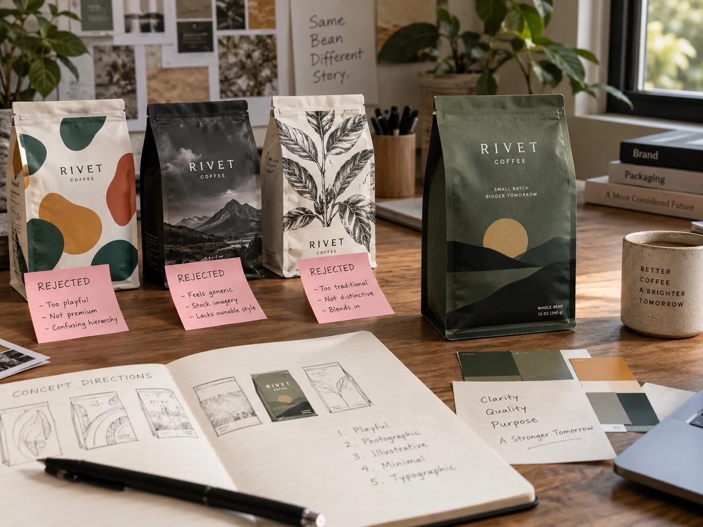
So I have learned to deliberately weaken my own presentations in one respect: I show the work in unflattering conditions on purpose. The package in a row of competitors, not alone on a gradient. The logo at the size it will be embroidered. The label after a real print test rather than a rendering. A screen at an ordinary brightness. If a direction only holds up when it is presented beautifully, that is a finding, and it is better to have it before production than after.
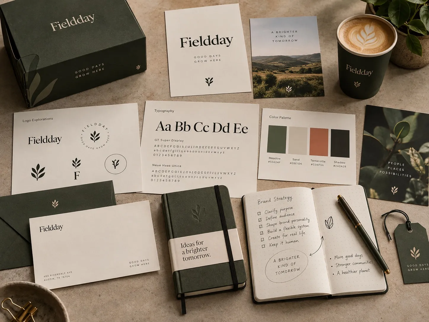
Most of what goes into getting that right never appears in the deck at all, which is the subject of what clients rarely see behind great branding. The concepts that were built and killed, the version where the mark failed at small sizes, the color that looked wrong on uncoated stock. That process is not decoration around the result. It is how the result gets to be trustworthy.
The work has to survive other people
After delivery, a brand stops being mine and starts being used. A sales assistant builds a deck at ten at night. A distributor produces a shelf talker without asking. Someone crops the logo to fit a social avatar. A printer substitutes a stock. None of these people are trying to damage anything, and all of them will make decisions the original designer is not there to make.
Designing beyond aesthetics means building for that reality from the start. It means a system simple enough to be followed by people with no design training, rules written in plain language, files organized so the right one is the easiest one to grab, and a logo that does not fall apart when it is used badly. A design that only works when handled by an expert is not finished.
This is the part I would most like clients to weigh when comparing proposals. The difference between work that looks great in a deck and work that still looks like itself in two years is rarely visible on the day of the presentation. It sits in the architecture, the documentation and the number of decisions that were made once so nobody has to make them again.
How to judge a concept before you approve it
When a direction is in front of you, resist the first question everyone asks, which is whether you like it. Replace it with three others. What is this trying to make someone believe? Who is that someone? What would have to be true for this to be the wrong answer? A designer who can answer all three has a rationale. A designer who cannot has an opinion, and so do you, and there is no way to settle it.
Then ask to see it badly. Ask for the package next to its three real competitors at actual size. Ask for the mark at one inch and in one color. Ask for the label on the actual substrate, not a render. Ask what happens to the layout when the legal copy grows by thirty words, because it will. Anything that only survives the ideal case is a risk you are accepting without being told.
Finally, ask what this direction makes easy later, and what it makes hard. A concept that depends on a specific photographic style commits you to producing that photography forever. A structure that requires a custom mold commits you to a minimum order for years. Those are business decisions wearing visual clothing, and they belong in the conversation before approval, which is exactly how I like to run a packaging design project from the first meeting.
Key points
- Craft matters, but a decision defended only by taste gives the next person with a different taste an equal claim.
- Credibility has no single visual form, so the right signals depend on the audience and what they are comparing you against.
- A brand system should be built for the second and third product, not only the one launching now.
- Production constraints are conditions of the design problem and produce stronger work when they shape the idea early.
- A polished presentation predicts very little, so concepts should be reviewed in unflattering, realistic conditions.
- Work is only finished when people without design training can use it correctly without asking anyone.