Does Your Company Really Need a Rebrand?
A rebrand is worth the cost when it closes a real gap between the business and how the market reads it.

When does a company actually need a rebrand?
A company needs a rebrand when the gap between what the business has become and what the identity says about it is costing real money: in lost deals, in mispriced expectations, in an audience that no longer fits. That is a business case, not a taste question. If the mark is still recognized and the position has not changed, the right answer is usually a focused evolution or better execution of what already exists. A rebrand should create more strategic value than the recognition and rollout cost of changing. If you cannot make that case, wait.
A rebrand costs more than design fees
When a client asks what a rebrand costs, the design fee is usually the smallest line on the list. The real bill is the rollout. Signage has to come down and go back up. Vehicles get rewrapped. Uniforms, business cards, trade show graphics and sell sheets get reprinted. Packaging needs new dies, new plates and a sell through period for the old stock. Marketplace listings, the website, the email templates and every social profile all have to change on roughly the same day.
Then there is the cost nobody puts in a spreadsheet. Recognition. Whatever familiarity the company has built with customers, distributors, referral sources and hiring candidates is partly tied to the current visual signals. Changing those signals does not erase the relationship, but it does reset a small amount of the work. For a few months, some people will not be sure they are looking at the same company they bought from last year.
The organization pays too. A new system has to be learned. Sales has to stop and explain the change. Every vendor needs new files and half of them will use the old ones anyway for a while. None of this is an argument against rebranding. It is an argument for knowing exactly why you are doing it, because the size of the bill is what makes the decision deserve a real case.
Rebrand when the business has changed
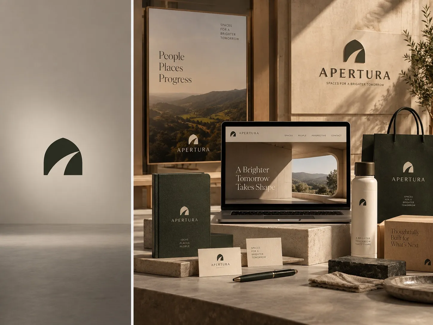
The clearest trigger is simple. The company is materially different from the one the identity was built for. A new market position, a major shift in who the customer is, a merger, a move into a new category, a move upmarket. In those situations the existing identity is not old fashioned. It is strategically inaccurate. It describes a company that no longer exists.
Picture a contractor who spent fifteen years doing residential repair work and now bids on commercial projects. The truck lettering, the hand drawn mark and the phone number in a starburst all worked perfectly for the old customer. In a room where a facilities director is comparing three bidders, those same signals quietly argue that this company is smaller and less established than its competitors. The work may be better. The signals say otherwise.
That is when visual change earns its cost. The identity has to make the new position believable, because prospects use visual cues as a shortcut for judging capability. If you are seeing several of these signals at once, it is worth reading five signs your brand has been outgrown before you commit to anything, because the pattern is usually clearer from a distance than it is from inside the company.
Recognition is an asset you already paid for
Recognition has value, and it is expensive to build. Every year the current mark has been in the market, on a truck, on a shelf, on an invoice, has deposited a small amount into an account. If customers know the name and can pick the package out of a lineup, throwing that away creates risk that a redesign has to earn back before it produces anything new.
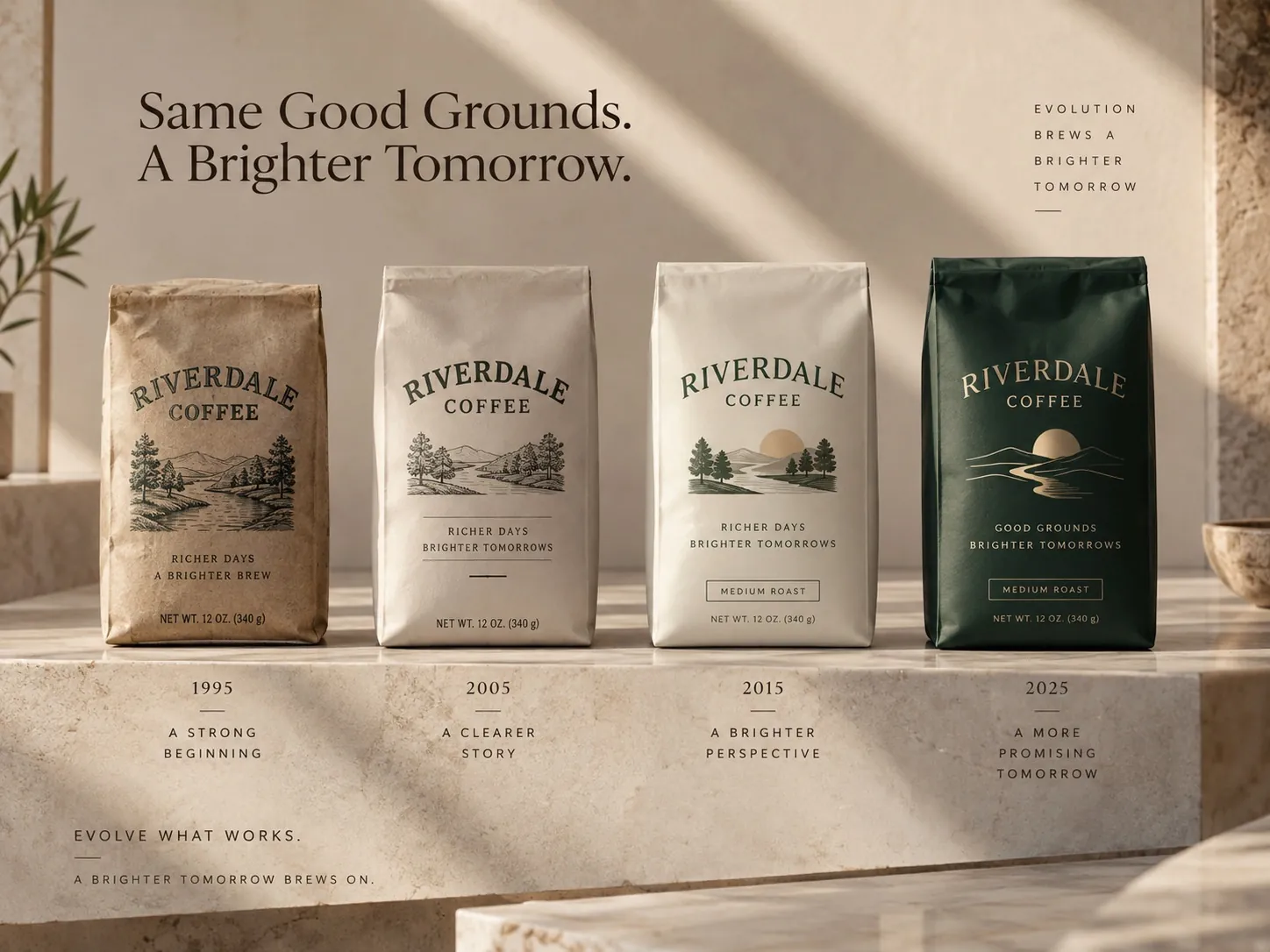
The good news is that a lot can be modernized without touching the part people recognize. Typography, color relationships, the layout grid, photography direction, how the brand behaves on a screen, how a product family is organized: those carry most of the impression of quality, and they can all change dramatically while the mark itself stays put. That middle path is often the correct one, and when evolution is better than revolution makes the case in more detail.
The useful test is to ask what customers actually recognize, not what the founder is attached to. In my experience it is rarely the fine detail of a wordmark. It is a color, a silhouette, a name, sometimes a single graphic element. Identify that, protect it, and treat everything else as available for change. That is how you modernize without spending your equity.
Sometimes the system is the real problem
A lot of brands look weak for a reason that has nothing to do with the logo. There are no standards. The mark gets stretched to fit a banner. There are four versions of the blue depending on who made the file. The sales deck uses a system font because nobody licensed the real one. Every vendor improvises, and the improvisations accumulate until the brand looks careless.
In that situation a redesign is an expensive distraction. The new logo will get stretched too, within about eighteen months, because the thing that caused the problem was never the artwork. What the company needs is a coherent system and a set of rules around assets that are already strong enough: file structures people can actually use, a defined type hierarchy, a palette with limits, templates for the things that get made every week.
Telling the difference is easier than it sounds. Gather forty real items the company has produced in the last two years and lay them out on a table. If each piece is reasonable on its own but they do not agree with each other, you have an execution problem. If each piece is weak even by itself, you have an identity problem. Confusing the two is how companies end up in the situation described in the most expensive design is the one you keep replacing.
Boredom is not a business reason
The internal team sees the logo hundreds of times a day. It is on every screen, every document, every door. Customers see it a handful of times a year, often without consciously registering it. Fatigue is an occupational hazard of working inside a brand, and it is not evidence of anything about how the brand performs in the market.
I take that fatigue seriously as a feeling and not at all as a reason. The question is never whether the identity feels tired to the people who made it. The question is whether it is helping or limiting the business: whether it wins the meeting, supports the price, fits the new product, attracts the people you want to hire. Those are answerable questions. Boredom is not.
Here is the honest check. Write down, in one sentence, the business problem the rebrand is supposed to solve, and name the consequence you can actually point to. Not a projected figure, just something real: a deal where the prospect assumed you were too small, a product line that has no room for a fourth variant, a recruiter telling you candidates find the company hard to read. If you cannot write that sentence, you are not ready to spend the money.
Do not rebrand to look like the category
Competitive pressure pushes companies toward the category aesthetic. Three competitors go quiet and geometric, so quiet and geometric starts to feel like what serious brands look like now. I have sat in that meeting many times. Somebody brings a deck of competitor screenshots and the unspoken conclusion is that we need to look more like them.
That instinct creates short term reassurance and long term sameness. If you adopt the code that everybody else just adopted, you have solved the fear of looking dated by taking on the certainty of looking interchangeable. There is also a timing problem. By the time a category aesthetic is obvious enough to copy, it is already in its second act, and you will arrive late to a look you will need to leave again.
A rebrand should sharpen the company’s own position, which sometimes means moving further from the category rather than closer to it. The useful version of competitive research is not a mood board of competitors. It is a map of what the category has already claimed, so you can decide what is still available and what would be worth owning.
What a focused evolution looks like
The middle path deserves a concrete description, because clients often think the choice is binary. Keep the name and the mark. Rebuild the system around them. Tighten the typography to one family used with real discipline. Cut the palette down to a primary, a secondary and one accent with defined roles. Establish a layout grid and use it everywhere. Define how photography is shot and cropped. Decide how the brand behaves on a phone.
For product companies, a large part of that work is architecture. A line with many variants needs a structure that tells shoppers what is the same and what is different. Itallian Color and Oxi is a professional hair color system where that question is unavoidable, because the range has to stay coherent across many shades and still let a stylist find the exact one they need. Solving that structure is often more valuable than redrawing the logo.
The risk profile of this path is much lower. There is no recognition reset, the rollout can be staged across normal reprint cycles, and the work can start with the surfaces that matter most instead of all of them at once. Customers experience it as a company that got its act together, not as a company that disappeared and was replaced by a stranger.
How to build the case before you spend
Start with the problem statement, written by the business side rather than by the designer. Name what is failing and where you see it: in the bid room, on the shelf, on the careers page, in the fourth flavor that will not fit the current layout. Keep it specific. A problem you can describe in concrete terms is a problem a designer can actually solve.
Then count the surfaces. Walk the building, the trucks, the warehouse and the website, and list every place the identity appears. Most companies are surprised by the length of that list, and the list is the rollout budget. You need it before you can weigh anything, because the decision is a comparison between a benefit and a real cost, not a comparison between a benefit and zero.
Then put the two side by side. If the value story is vague and the cost list is three pages long, you have your answer for now. If the value story is specific and urgent, you have a project worth scoping properly, whether that turns out to be a full rebrand or a rebuilt brand identity system around the equity you already have.
The three outcomes to choose between this week
Run the table exercise first, because it costs nothing. Print or gather everything the company has produced recently: the website, the last four social posts, a proposal, a sell sheet, a package, a photo of the sign, a photo of a truck. Put them in front of three people who do not work with you every day and ask them what kind of company this is and what it probably charges.
Then answer four questions honestly. Has the business materially changed since the identity was created? Do customers recognize any element of the current brand? Do the pieces on that table disagree with each other? Is there a business consequence you can name, not estimate? The pattern of answers points at the decision more reliably than any internal debate about whether the logo still feels current.
You are choosing between three outcomes, and only one of them is a rebrand. Change the identity because the company changed. Evolve the system because the equity is still worth keeping. Fix the execution because the assets were never the problem. If you want a second opinion before committing to the expensive option, that is a reasonable thing to get in touch about, and it is a much cheaper conversation than an unnecessary rollout.
Key points
- The design fee is the smallest part of a rebrand, because the rollout and the lost recognition carry most of the real cost.
- A rebrand is justified when the identity has become strategically inaccurate, meaning it describes a company that no longer exists.
- If every piece is decent on its own but they do not agree with each other, the problem is execution and a redesign will not fix it.
- Internal fatigue with a logo is not evidence about how the brand performs, so the case has to be written in business terms.
- Copying the category aesthetic buys short term reassurance and long term sameness, and you will always arrive late to that look.
- Most companies are choosing among three outcomes: a full rebrand, a focused evolution, or simply fixing how existing assets are used.