
Case study · Packaging Design
PyurX
Hand Sanitizer & Disinfectant Line Packaging
PyurX is a hand sanitizer and disinfectant line built on a plain commercial truth about the hygiene aisle: the efficacy number is what closes the sale, so the number gets the best real estate on every package.
01
Designing around the number that sells
Shoppers here are comparing claims, not brands. Someone standing in the aisle with a bottle in each hand wants to know the alcohol percentage and what it kills, and nothing else registers until those two facts are settled. So the efficacy claims became the primary typography of the system rather than small print pushed down to the base of the label where legal copy usually goes.
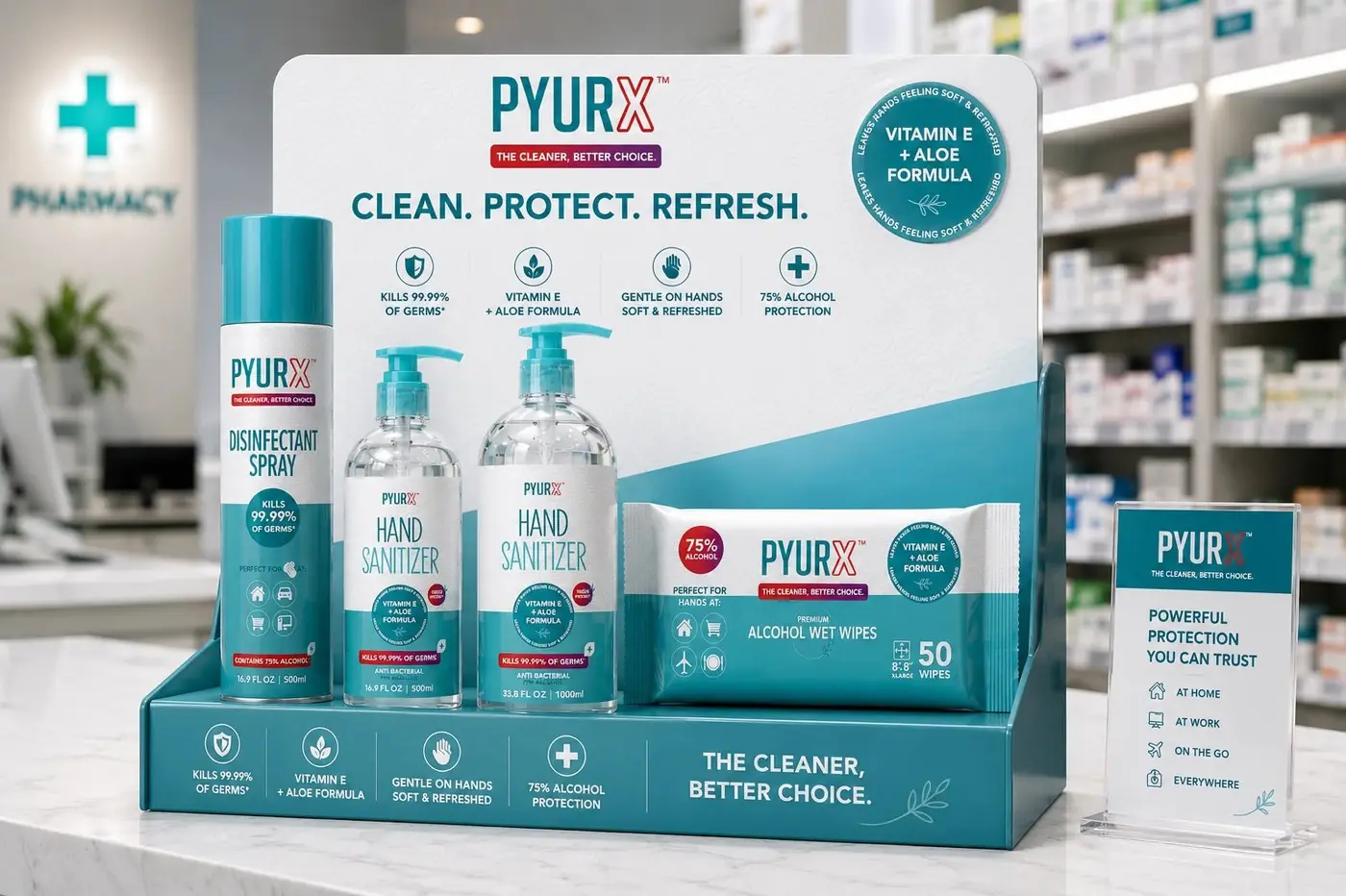
That single decision set everything after it. White holds the top of each pack where the name and the claim live, teal takes the lower half, and red is reserved almost entirely for the efficacy badge so the eye goes there first and lands there again on the next format. I kept the wordmark compact and out of its own way, because on this shelf the brand's job is to be trusted quickly rather than admired.
02
A range you do not have to decode
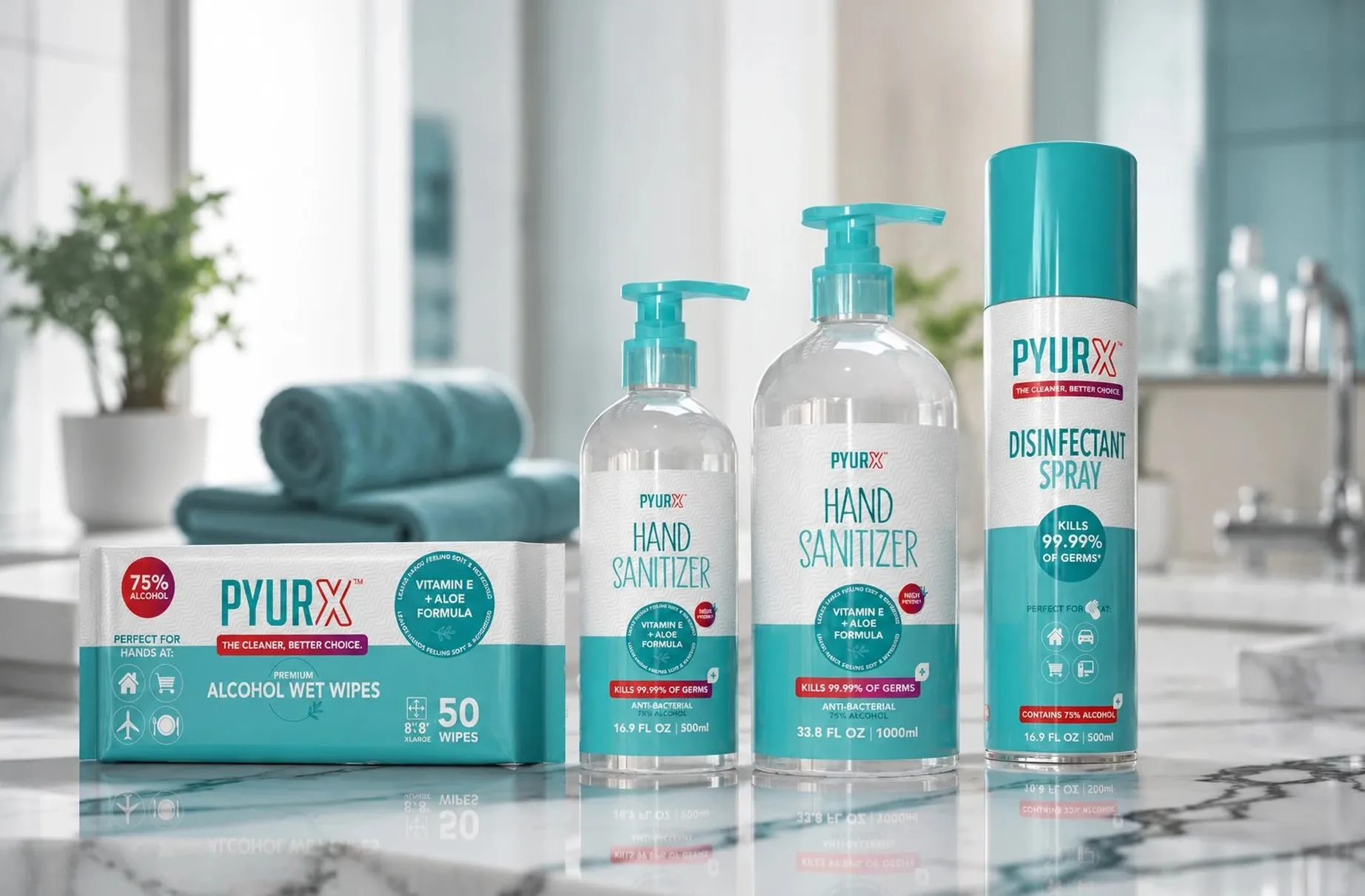
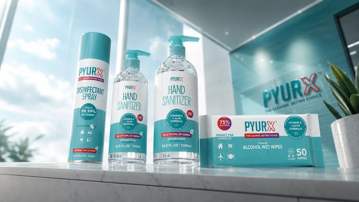
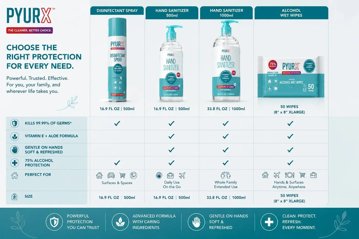
The claim sits in the same position at the same weight on the wipes carton, on both sanitizer bottles and on the spray. That consistency is not tidiness for its own sake. A customer moving between formats never has to relearn where to look, which makes the range read as one decision rather than four products that happen to share a logo.
Both sanitizer sizes wear the same teal pump, a small move that does a lot of work. It tells someone at a glance that the large bottle and the small one are a matched pair, a counter size and a refill, instead of two options that need comparing from scratch. On the wipes, a few use-case icons answer where you would actually use this without spending a line of copy on it.
I shot the full range together in a bathroom rather than against a plain white backdrop, with soft towels and a plant in frame, because a hygiene product that looks like it belongs on a counter at home sells differently from one that recalls a hospital corridor. Clean is the reassurance this category needs. Clinical is not.


Have a project like this?
Tell me what you are building, changing or launching, and I will help you define the right scope and direction.