The Difference Between Decoration and Design
Decoration changes how something looks. Design changes how it communicates, functions or gets understood.

What is the difference between decoration and design?
Decoration and design can both make something more attractive, which is why they get confused. The difference is purpose. Decoration works on the surface and is judged by whether it pleases. Design starts from a problem that includes an audience, a context and an outcome, and it is judged by whether that problem gets solved. Design can be beautiful, but the beauty is working inside a larger objective. The practical test is simple: if a choice cannot be explained by who it is for and what it needs to do, it is styling.
Both improve the look, which is why they blur
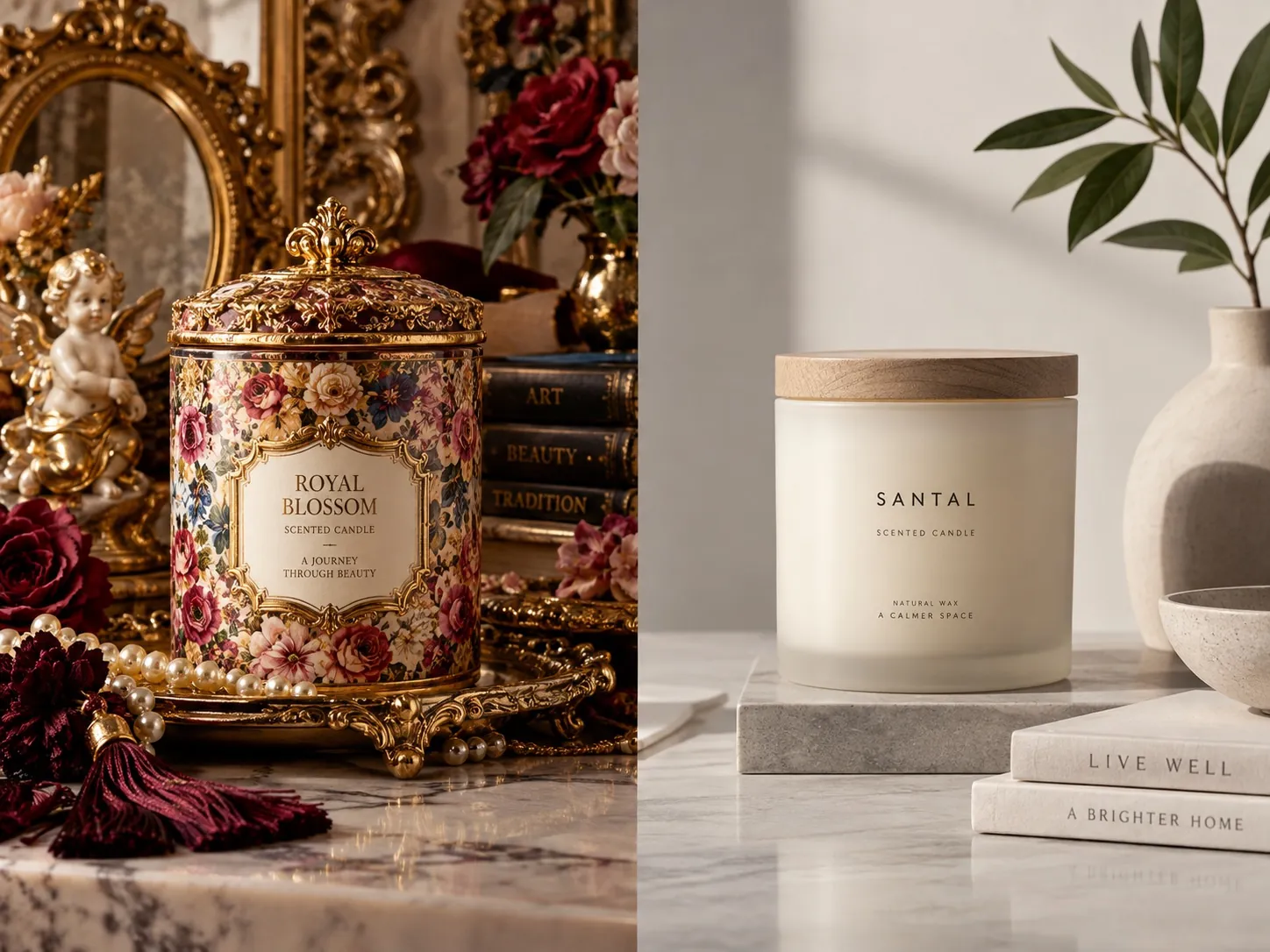
I do not think decoration is a dirty word, and I am suspicious of designers who talk as if it were. A pattern on an end panel, a foil detail on a box, an illustration that exists mostly because it is pleasant: these can be perfectly good choices. The confusion is not that decoration is bad. It is that decoration and design produce a similar feeling in the room when they are presented, so companies buy one while believing they bought the other.
The feeling is approval. Both make people say it looks great, and both can be shown in a deck full of mockups that flatter them. What they do not share is a way of being right. Decoration is right when it pleases the people looking at it. Design is right when it changes what a stranger understands or does, which is a claim you can check later and be wrong about.
That difference in accountability is the whole subject. It determines whether feedback is useful, whether the work can be defended when a new executive arrives, and whether the money spent turns into an asset or an event. A company can afford decoration. What it usually cannot afford is paying for decoration while expecting it to solve a communication problem.
Design starts from a problem
A design problem has three parts: someone specific, a situation they are in, and something that needs to happen. A package has to stand out on a shelf without leaving its category. A website has to make a complicated service understandable to a buyer who is not technical. An identity has to make a fifteen year old company read as established rather than tired. Each of those contains an audience, a context and an outcome, which means each one can be solved well or badly.
Watch what that does to the work. Once the problem is stated, some ideas disqualify themselves immediately, including attractive ones. A beautiful minimal package can be the wrong answer when the product depends on explaining three things at the point of purchase. A striking mark can be the wrong answer when it has to be embroidered on a chest pocket and etched into a monument sign. The constraint is not an obstacle to the idea. It is part of what makes an idea correct.
This is also why I ask so many questions before drawing anything. Where will this live. Who has to understand it in two seconds. What are they comparing it against. What is the production reality. The answers determine whether my instincts are pointing anywhere useful, and they are the reason every design decision should have a business reason behind it.
Decoration starts from a surface
The requests that signal decoration are familiar. Make it more premium. Add some texture. Can we do something bold here. There is too much white space. These are not illegitimate, and sometimes they are exactly right. But they begin from the appearance of a surface rather than from anything a person outside the company needs. That makes them impossible to evaluate, because there is no condition under which they could be wrong.
What usually sits underneath such a request is a real concern that has been translated into a styling instruction. Make it more premium often means our price is higher than we look. Too much white space often means I am afraid we are not saying enough. The useful move is to translate it back. Once I know that a retail buyer thinks the line looks cheap next to the brand beside it, I have a problem to solve, and the solution might be material rather than graphic.
Where decoration becomes expensive is when it is asked to carry strategic weight. Adding ornament to a brand nobody understands makes a confusing brand more elaborate. It buys a few weeks of internal satisfaction and leaves the actual issue untouched, which is why the same company is often back a year later asking for another refresh.
Hierarchy is the clearest tell
If I had to identify design thinking from a single glance, I would look at priority. What did this want me to see first? Is there a second thing, and does it wait its turn? Work built around a communication objective almost always has a visible order, because someone decided what matters most and gave up something to protect it.
Decoration tends to be democratic in a way that hurts it. Everything gets a little emphasis, because every element had someone defending it. Four things become important, which means nothing is, and the viewer has to do the sorting that the design was supposed to do for them. Most people will not. They will form a vague impression and move on, which is the quiet failure mode nobody puts in a report.
Hierarchy is also where the internal politics show up most clearly. A front panel with three competing focal points is usually a record of a negotiation rather than a decision. That is why I would rather argue about priority early with the people who can settle it than discover at the proofing stage that nobody was ever willing to say which element comes first.
Design is willing to remove things
Decoration adds. That is its natural direction, and it feels productive, because every addition is visible proof that work happened. Design adds too, but it is equally willing to subtract, and subtraction is the harder discipline, since nobody ever admires the element you removed.
Removing is how a message gets loud without getting bigger. Take two claims off a front panel and the remaining one finally registers. Cut a typeface and the hierarchy starts to work. Drop the third color and the range suddenly reads as a family. These are small acts with disproportionate effect, and they are the reason a restrained solution usually takes longer to arrive at than a busy one. I have written more about that cost in why simplicity is expensive.
The judgment involved is not about liking less. It is about knowing what each element is for. If you cannot say what a thing is doing for the viewer, it is a candidate for removal, and if removing it changes nothing, that answers the question. Running that pass honestly is uncomfortable, because some of the elements that fail the test are the ones people enjoyed making.
When decoration is exactly the right answer
There is nothing wrong with decoration when decoration is what the project needs. A seasonal sleeve, a limited run label, a pattern on the interior of a box that exists purely as a small pleasure when it is opened: none of that needs a strategic defense. Delight is a legitimate objective, and the absence of a business rationale for a pattern inside a lid is not a failure of rigor.
Decoration also does real work inside a system that is already sound. Once hierarchy, structure and the core signals are settled, ornament is what gives a brand warmth and specificity, and it is often the part people remember affectionately. A brand made only of correct decisions can end up feeling like a form. The craft layer is what keeps it from being cold.
The line is about expectation. Decoration applied to a working system enriches it. Decoration applied instead of a system substitutes for thinking that still has to happen. The problem is not the ornament. It is the hope that surface styling will resolve a positioning question, which it never has.
Aesthetics should be accountable to meaning
Saying design is more than appearance is not the same as saying appearance does not matter. It matters enormously, because every visual choice makes an impression whether or not anyone intended it. The point is that those impressions should be chosen rather than inherited from whatever was fashionable when the file was opened.
A technical brand can use precision, structure and dense information to signal competence. A luxury product can use restraint, space and material detail to signal confidence. A children’s product can use energy and color to signal that it is not serious in the way an adult product is serious. None of these are universal rules, and that is the point: the visual language is chosen because it supports a specific position, not because it is inherently correct.
When aesthetics are accountable in that way, something useful happens to the review. Instead of defending a typeface because I like it, I can say what it communicates and why that matters here, and the client can disagree with the reasoning rather than the taste. That is the conversation that produces work which still makes sense after the people who approved it have moved on, and it is closely related to the idea that good design is invisible when it is doing its job.
How to tell which one you bought this week
Take the three most visible things your company has made recently: a package, a page, a piece of sales material. For each one, pick five individual decisions you can point at, such as the size of the headline, the color of the button, the photograph on the front, the finish on the box, the space around the mark. Write one sentence for each explaining who it is for and what it does.
The sentences that come easily describe design. The ones where you find yourself writing that it looks better that way describe decoration. Neither answer is shameful, and a healthy piece of work will contain both. What matters is the ratio, and where the decoration sits. Ornament on top of a clear hierarchy is fine. Ornament standing where the hierarchy should be is a problem you have been paying for.
Then take the one asset carrying the most commercial weight and run a single test on it. Ask three people outside the company what it is, who it is for and what makes it different. If the answers come back scattered, you do not need more visual interest. You need a decision about priority, which is the cheapest and least glamorous fix available, and the one that makes every later identity and brand system choice easier to get right.
Key points
- Decoration is judged by whether it pleases, while design is judged by whether a stated problem gets solved.
- A real design problem names someone specific, the situation they are in, and the outcome that has to happen.
- Requests like make it more premium are usually real concerns translated into styling language, and worth translating back.
- Visible hierarchy is the clearest sign of design thinking, because it proves someone decided what matters most.
- Decoration enriches a system that already works but cannot substitute for one that was never built.
- Aesthetic choices should be defensible through audience, positioning and use, so reviews argue about meaning rather than taste.