Why Taste Alone Doesn’t Build Brands
Good taste can make work attractive. It cannot decide what a business should mean in the market.

Why is personal taste not enough to build a brand?
Taste tells you whether something is well made. It does not tell you what a company should mean to the people it needs to reach. Those are different questions, and only the second one is a brand question. A beautiful identity can still target the wrong buyer, imitate the category it needed to stand apart from, or promise a personality the business cannot deliver. Taste is also personal, while positioning is relational: it only makes sense next to competitors, customer expectations and price. Used after the problem is defined, taste is powerful. Used instead of defining it, taste produces work that looks right and does nothing.
What taste is actually good for
I want to start by defending taste, because the argument that follows can sound like a dismissal and it is not. Taste is a real skill and it takes years to build. It is what lets someone see that a letterform is a hair too heavy, that a layout has three competing focal points, that a color is technically correct and emotionally wrong, that a curve has been drawn rather than constructed.
Without it you get work that is strategically defensible and visually mediocre, which is its own kind of failure. Customers do not grade on intent. A package that reasons its way to the right position and executes it clumsily is read as clumsy, and the reasoning is never visible to anyone outside the review meeting.
So taste is not optional, and anyone who tells you strategy alone is enough has probably never had to make something that had to sit on a shelf next to a competitor with a better design team. The problem is not that taste is unimportant. The problem is what happens when it is asked to answer questions it cannot answer.
Taste is personal, positioning is relational
Here is the core distinction. Taste is a judgment about an object. Positioning is a judgment about an object in a context, and the context is doing most of the work. You can hold a bottle in your hand and assess whether it is well made without knowing anything else. You cannot assess whether it is the right bottle for this company without knowing what sits beside it.
A brand does not exist in a vacuum. It exists next to four competitors on a shelf, or eleven thumbnails in a search result, or three proposals on a buyer’s desk. It exists against expectations the customer already has about what this kind of company looks like, what it costs, and what the signals in this category mean. Change the neighbors and the same design performs differently, without a pixel moving.
This is why the question "do you like it?" is close to useless in a design review, and why I try to replace it. A design can be objectively well made and still be the wrong move, because the relevant question is not whether it is good but whether it occupies a useful position relative to everything else the customer will see that day. Personal preference is one input into that, and usually not the most important one.
The practical consequence is that you cannot evaluate a concept on a white background. I show work in context whenever I can: on a shelf with real competitors, at thumbnail size, next to the other options a buyer is holding. Half the disagreements in a review evaporate when people can see the alternative the customer is actually comparing against.
A beautiful brand can be strategically wrong
There are a few specific ways this failure shows up, and they repeat across industries and price points with enough regularity that I now look for them on purpose. Each one produces work that reviews well internally, because the people reviewing it share the assumption that created the problem in the first place.
The first is appealing to the wrong person. Design teams tend to make work that impresses other design teams, because that is the audience whose approval is immediately available. The result is often refined, restrained and current, and completely misaligned with a buyer who wants reassurance, legibility and evidence. A law practice and a skate brand cannot be judged by the same standard. The stationery system I made for Lane Law Office and the deck graphics for Surfskate Love are both meant to be well made, and they would be catastrophic if you swapped them, not because either is bad but because each one is answering a different room.
The second is promising a personality the business cannot deliver. A brand that looks like a concierge service and answers support tickets in four days has created a gap, and the customer experiences that gap as a broken promise rather than as a design decision. Presentation sets the standard the experience is measured against, which means overpromising visually makes an ordinary experience feel worse than it would have felt with no promise at all.
The third is the most common and the hardest to see from inside: looking exactly like the category you needed to be chosen over. This one is difficult because it feels like success while it is happening. The work looks current, it looks professional, it looks like it belongs, and belonging is precisely the problem when the customer is trying to tell you apart from four other options.
When good taste becomes category sameness
Taste is largely learned from the same sources. Designers look at the same references, follow the same work, absorb the same sense of what currently reads as premium. When an entire industry’s designers agree on what good taste looks like, the brands in that industry converge.
You can watch it happen in real time. A category discovers that a soft neutral palette and a light geometric sans read as modern and trustworthy, and within two years half the shelf is soft neutrals and geometric sans. Every individual decision was defensible. The collective result is a shelf where nothing can be told apart at arm’s length, and the customer defaults to the cheapest option or the one they have heard of, because nothing gave them a reason to do otherwise.
This is where taste actively works against the business. The instinct that says "this looks right" is often the instinct that says "this looks like the others," because familiarity and correctness feel identical from the inside. A designer with good taste and no strategy will reliably produce the current consensus, beautifully executed.
Strong creative direction requires something taste does not supply: knowing which category cues to honor and which to break. Some cues are load bearing. In supplements, certain information has to be present and legible or the product loses credibility immediately. In professional products, a cue that signals amateur use is expensive. Other cues are just fashion, and those are the ones worth abandoning. Telling the two apart is a strategic judgment about what the customer needs to believe, not an aesthetic one, which is the whole reason strategy comes before design.
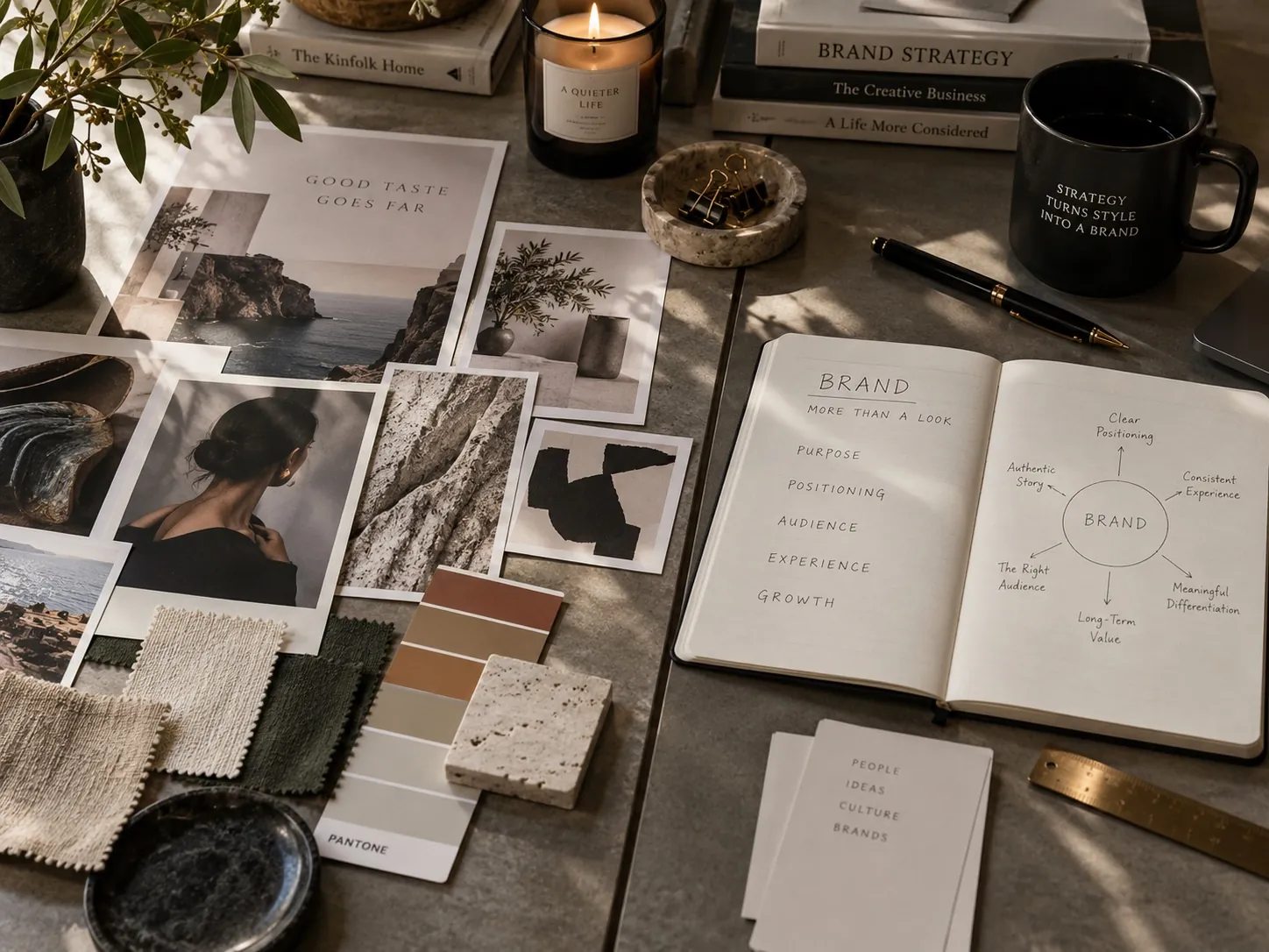
A mood board is not a system
Taste is very good at producing one beautiful moment. Brands do not get to live in one moment. They live in a long sequence of unglamorous applications, most of which the person who designed the beautiful moment never sees and would not enjoy working on. This is the gap where a lot of well received identity work quietly falls apart in the year after it launches.
A mood board creates an atmosphere, and atmospheres are seductive in a presentation. But the work has to survive hundreds of applications that nobody put on the board: a back panel with a regulatory paragraph, a spreadsheet exported as a PDF, a vehicle wrap, a two color version for embroidery, a thumbnail at ninety pixels wide, a form someone fills out on a phone. Most of those are ugly problems, and taste tends to avoid ugly problems rather than solve them.
That is the difference between a look and a system. A system needs typographic range, because a single beautiful display face will not set a caption, a warning, a table or a long paragraph. It needs a color hierarchy, not just a palette, so that people know which color means primary action and which means a product tier. It needs photography rules that a third party can follow. It needs an answer for the case nobody anticipated.
And it has to work in the hands of people who are not you. The real test is what a distributor’s designer produces with it, or what a sales rep builds the night before a meeting. If the system only holds when its author applies it, the company bought a look and will be repurchasing it soon.
None of this is an argument for making things plainer. Simplicity that survives every one of those applications is significantly harder to design than a rich composition that only works at one size, which is why simplicity is expensive rather than a shortcut.
Taste belongs after the problem is defined
The sequence is what matters, and it is the part that is easy to state and hard to hold to. Almost everyone agrees with it in principle. Almost every project drifts from it in practice, because visual work is exciting and problem definition is not, and because a client who has just approved a budget wants to see something rather than read something.
First you decide what the work has to do. Who it has to convince, what that person currently believes, what the alternatives look like, what has to be understood in four seconds, what the business can actually deliver, where the piece will appear and at what size. That is a set of constraints, and it is not a creative brief in the decorative sense. It is a definition of the problem.
Then taste goes to work, and this is where it becomes powerful rather than decorative. Two directions can both satisfy the same strategy, and the difference between them is craft: proportion, restraint, the right typeface rather than an adequate one, the decision to remove the third element. Strategy narrows the field to the moves that are correct. Taste chooses the one that is also good, and that choice is often what makes the work distinctive instead of merely accurate.
Reverse the order and you get the most common failure I see in brand projects: a gorgeous system that nobody can defend when a new marketing director asks why. Work that cannot be explained does not survive a change in leadership, and the company ends up paying for the same identity twice.
Telling taste from judgment in a review
Both sound the same in a meeting. Both come out as confident opinions, delivered at the same volume by people with the same job titles. The difference is whether the opinion connects to something outside the room, and learning to hear that difference is the single most useful skill a non designer can bring to a brand project.
A taste argument stops at the object: this feels dated, this is too heavy, I do not like the green. A judgment argument connects the object to a consequence: this reads as a lower price tier than we charge, this will not hold at thumbnail size on a marketplace listing, this color already belongs to our biggest competitor in the cooler. The second kind can be tested and is worth arguing about. The first kind is a coin flip with a confident voice.
I hold myself to that standard as well, and I lose arguments to it regularly. If I cannot explain a choice through audience, positioning or use, I have a preference rather than a reason, and a preference is not something a client should pay for. That is the discipline behind the idea that every design decision needs a business reason, and it applies to the designer before it applies to anyone else.
Be equally careful with the other failure mode. Rationalization is not strategy. It is easy to build a plausible story around a choice made because it looked nice, and that story holds up in the room and collapses in the market. The test is whether the reasoning came before the decision.
What to bring to your next design review
Change the opening question. Instead of asking whether people like it, ask what the work is supposed to make a specific person believe, and have someone write the answer on the wall before anything is shown. Half the noise in a review comes from people evaluating against different unstated goals.
Bring context into the room. Put the concept next to the four competitors the customer will actually see. Print it at the real size. Look at it as a thumbnail on a phone. If the work only wins on a clean white slide, you have learned something important before spending money on it.
Then run every significant choice through one sentence: this decision helps because the buyer is X and currently assumes Y. Do it for the color, the typeface, the format, the name placement. The choices that cannot complete the sentence are not necessarily wrong, but they are unexamined, and unexamined choices are the ones that get reversed by the next person who has an opinion.
Finally, check the system, not the showpiece. Ask to see the awkward applications: the two color version, the smallest use, the back panel, the template a non designer will use. If nobody has made those yet, you are looking at a look. Looking through finished systems rather than hero images is also the honest way to evaluate anyone you are considering hiring, which is most of what my work is meant to show.
Key points
- Taste judges whether something is well made, while positioning judges how it performs next to the alternatives a customer is actually comparing.
- A beautiful identity can still be wrong by addressing the wrong buyer, promising a personality the business cannot deliver, or matching the category too closely.
- When an industry’s designers share the same references, good taste produces convergence, so knowing which category cues to break is a strategic decision.
- A mood board creates one moment, but a brand has to survive hundreds of applications in the hands of people other than the original designer.
- The sequence matters: define what the work must do first, then use taste to choose among the options that are already correct.
- Creative choices are stronger when they can be explained through audience, positioning and use, and reasoning invented after the fact is not strategy.