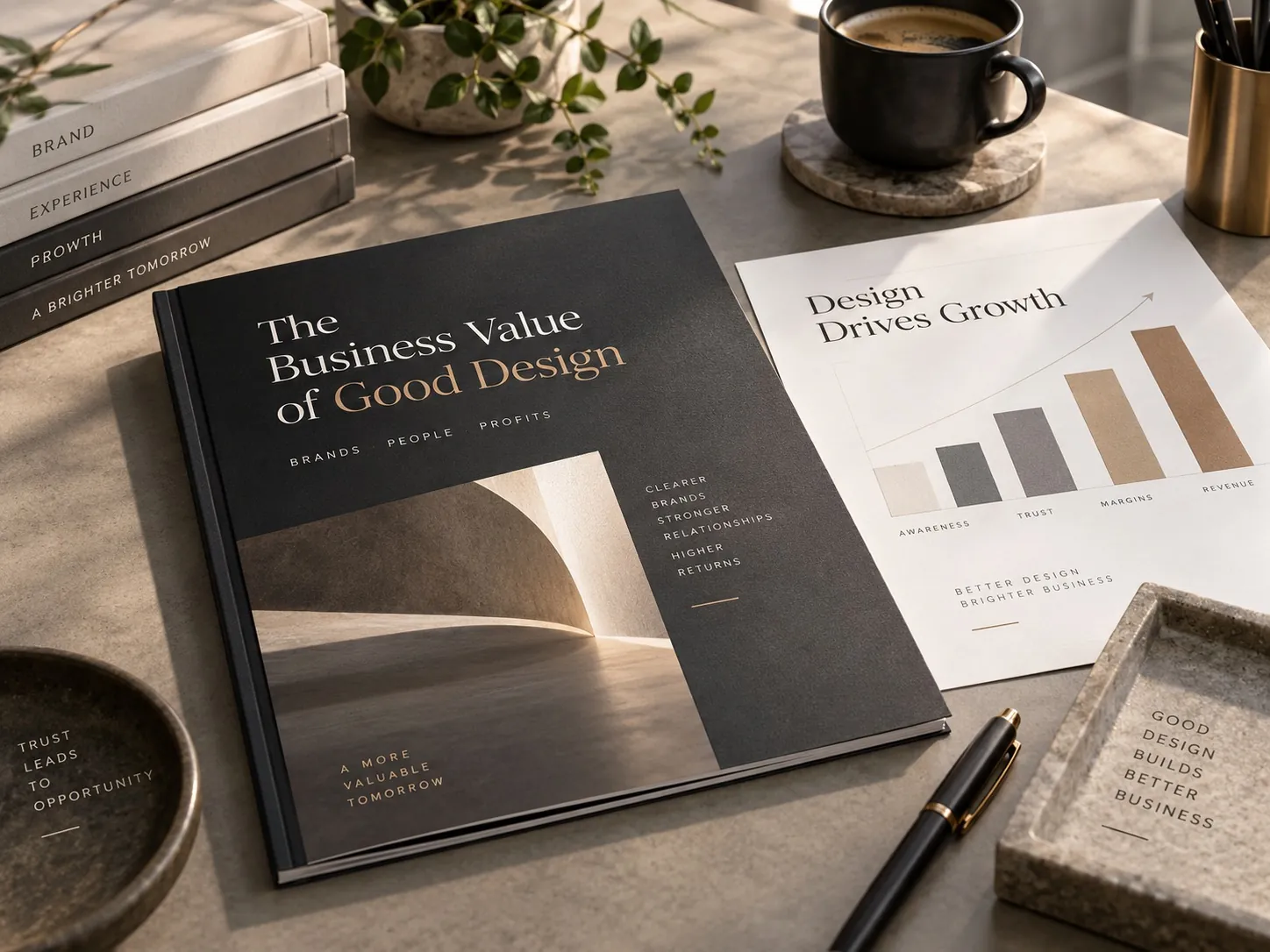
The Business Value of Good Design
Design earns its budget when it makes a company easier to understand, easier to trust and easier to choose.

How does good design create business value?
Good design creates business value when it changes what people do, not only how they feel about a logo. It makes a company easier to understand, easier to trust and easier to choose, which shortens the distance between attention and a decision. It gives a price somewhere to land, so a higher number becomes easier to believe. It also creates internal value: a brand system gives teams reusable rules, so the next package, campaign or sales sheet becomes production work instead of a small branding project started from zero.
Taste is a weak argument for a budget
I have sat in a lot of rooms where the conversation about design never leaves the question of whether people like it. Someone prefers the blue. Someone finds the type too small. Someone brings up a competitor they admire. All of that is real, and none of it tells the company whether the work will do anything. When the only defense of a design is that it looks good, its budget is the first one cut, because taste is the easiest thing in a business to argue with.
I am not against beauty. Attractive work earns attention, it makes people proud of what they sell, and it tends to stay consistent because nobody wants to break something they like. But beauty is a property of the artifact. Value is a property of what happens next. The more useful question is whether a shopper who has never heard of the brand can tell what it is, decide it looks credible, and reach for it before their attention moves somewhere else.
That shift changes who belongs in the review. Once you accept that design is supposed to move a behavior, the people who understand the behavior should be there: whoever takes the sales calls, whoever reads the support tickets, whoever negotiates with the buyer. Their contribution is not preference. It is a list of the things customers keep getting wrong, which is the raw material of a real design brief.
The quiet cost of being hard to understand
Every confusing brand charges its customers a small tax. They have to work out what the company does, whether it is legitimate, and why any of it is relevant to them. Most people will not pay that tax. They leave the page, skip the shelf, or ask a question a salesperson then answers for the hundredth time. The cost never appears as a line item, which is exactly why it can go unexamined for years while everyone assumes the problem is the ad spend.
You can usually find it by listening to your own team. If the same three questions come up on every call, the brand is failing to answer them before the call. If a distributor keeps shelving your product in the wrong section, your package is signaling the wrong category. If people compliment the website and still ask what you actually sell, the design is decorating a message that was never made clear in the first place.
Clarity is not the same as plainness. A strong hierarchy tells a person what to read first, second and third, and it does that without making them think about it. A recognizable identity means they do not have to verify who you are every time they meet you. When I build an identity system meant to hold up as a business grows, most of the effort goes into deciding what gets priority, not into adding more.
Design gives the price somewhere to land
Nobody judges a price in a vacuum. They compare it against what the presentation led them to expect, and that expectation is set in the first second, long before anyone reads the back panel. If a package looks like it belongs one level below your price, the number feels wrong even when the formula inside is excellent. The customer does not conclude that they misjudged the product. They conclude that you are charging too much, and they move on.
This is why I push back when a client wants to raise prices and change nothing else. Design cannot manufacture value that is not there, and I would not want it to. What it can do is make real value legible. Material choices, restraint in the typography, the quality of the photography, the discipline of the layout: these are the signals people use to place a product on a mental price ladder. I go deeper into that mechanism in why customers buy perceived quality rather than quality.
The trade off deserves to be said out loud. Raising the visual level raises expectation, and expectation has to be met by the product, the shipping box and the person who answers the email. Presentation that writes a check the experience cannot cash produces returns and bad reviews. Design should sit slightly ahead of where the business is today, not two floors above it.
A system turns launches into production work
The first time a company builds a brand properly, it feels expensive. The second flavor, the third size, the trade show booth and the sell sheet are where the money comes back. If typography, color, packaging architecture, photography rules and the layout grid are already decided, a new product becomes a production task measured in days. If they are not, every new item reopens the entire brand, and a junior designer working against a deadline makes decisions nobody will revisit for years.
I see this most clearly in packaging lines. A supplement brand adding its fourth flavor has one question to answer: what stays fixed so the family reads as a single thing, and what varies so the flavors can be told apart at arm’s length. Answer it once, inside a system, and the tenth flavor is easy. Answer it one package at a time and the line drifts until the shelf looks like four different brands standing next to each other.
The same logic applies to everything that is not packaging. A proposal template, an email signature, a vehicle wrap and a booth graphic all involve the same handful of decisions. Making those decisions once is the difference between a company that produces material quickly and one where every small request turns into a week of opinions.
Recognition is the part competitors cannot copy
Features get copied. Prices get matched, usually within a quarter. Supplier lists are not secrets. What is genuinely hard to replicate is the accumulated familiarity of a brand that has looked like itself for years, because a competitor cannot buy back the time it took to build. That familiarity is an asset the company owns, and unlike most assets it grows in value when you leave it alone.
This is the argument for resisting the urge to refresh everything whenever a new marketing lead arrives. Consistency is not timidity. It is the mechanism that lets recognition compound, which is the case I make in why brand consistency works as a growth strategy. The companies that feel established are usually not the oldest ones. They are the ones that stopped changing their mind in public.
Distinctiveness matters just as much. Being consistent about a look that is nearly identical to four competitors only makes a company reliably invisible. The work is finding the specific combination of shape, color, voice and structure that belongs to you, and then holding it long enough for people to learn it without being told.
The internal value that never reaches an invoice
A brand system does something for the company that has nothing to do with customers. It ends arguments. When the rules exist and are written down, the discussion about the new sell sheet takes ten minutes instead of two weeks, because questions that used to be matters of opinion now have answers. That recovered time is real money, and it is usually the benefit clients mention first when we talk a year later.
It also protects the brand from turnover. People leave, agencies change, a distributor produces a point of sale display without asking anyone. A documented system is the only thing keeping each of those moments from pulling the brand a little further from itself. Without it, the brand lives in the memory of whoever has been there longest, which is a fragile place to store something valuable.
It changes conversations founders do not expect. A candidate reads your careers page and your packaging as evidence of how the company is run. So does a retail buyer, a supplier deciding whether to extend terms, and an investor looking at a product sitting on a table. None of them mention it, and all of them price it in.
Where design will not save you
I would rather lose a project than take one where design is being asked to fix the wrong thing. If the product does not work, better packaging only speeds up the discovery of that fact. If the pricing is broken, a premium look widens the gap between promise and reality. If nobody wants the category, a beautiful identity buys you a better funeral. Design multiplies what already exists, and a multiplier applied to a weak number stays weak.
There is a timing question too. Very early, when the offer changes every month, an expensive identity can lock in an idea the founder is about to abandon. In those cases I usually suggest doing the minimum that looks credible, keeping it flexible, and investing properly once the business knows what it is. Spending well includes knowing when not to spend yet.
So the honest business case is narrower than the one most agencies sell. Design earns its keep when real value exists and is being communicated badly, when growth is creating inconsistency faster than the team can absorb it, or when the company is walking into rooms where it is not yet taken seriously. Those three situations are where the money reliably comes back.
What to check in your own company this week
Start with the questions you keep answering. Ask the people who talk to customers to write down the three things buyers misunderstand most often. Then open your homepage, your main package and your sales deck, and see whether any of them answer those three things in the first few seconds. If they do not, you have found the most valuable design work available to you right now, and it is probably not a new logo.
Next, count the versions. Gather everything produced in the last twelve months: packaging, ads, the trade show banner, the invoice template, the last three social posts. Put it all on one table. If you find more than one blue, more than two typefaces and three different ways of writing your own name, your team is rebuilding the brand every time it makes something, and the cost is being paid in hours nobody tracks.
Then decide what is fixed. Write one page naming the colors, the type, the logo rules and the two or three things that never change. It does not need to be a brand book and it does not need to be beautiful. It needs to exist and be easy to find. If it helps to see what a finished system looks like across a family of products, the project work on my site shows how the same decisions carry from a package to a sign to a sales sheet.
Key points
- Design becomes a business investment rather than an expense when it is judged by the behavior it changes, not by whether stakeholders like it.
- Confusing brands charge customers a hidden tax in effort, and most customers pay it by leaving instead of asking.
- Customers form a price expectation from presentation before they evaluate the product, so visual level and price need to agree.
- A documented brand system turns each new launch into production work and protects the brand from turnover and drift.
- Accumulated recognition is the one competitive asset rivals cannot copy, because they cannot buy the years it took to build.
- Design multiplies value that already exists, so it will not rescue a broken product, a broken price or a category nobody wants.