Packaging Design | Supplement

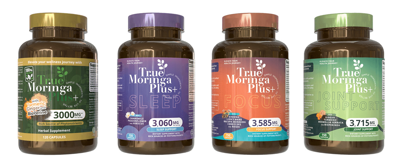
For the “True Moringa Plus” product line, we took a meticulous approach to design, aiming to clearly differentiate each supplement’s unique benefits while maintaining a cohesive brand aesthetic. Here’s an insider look at the creative process:
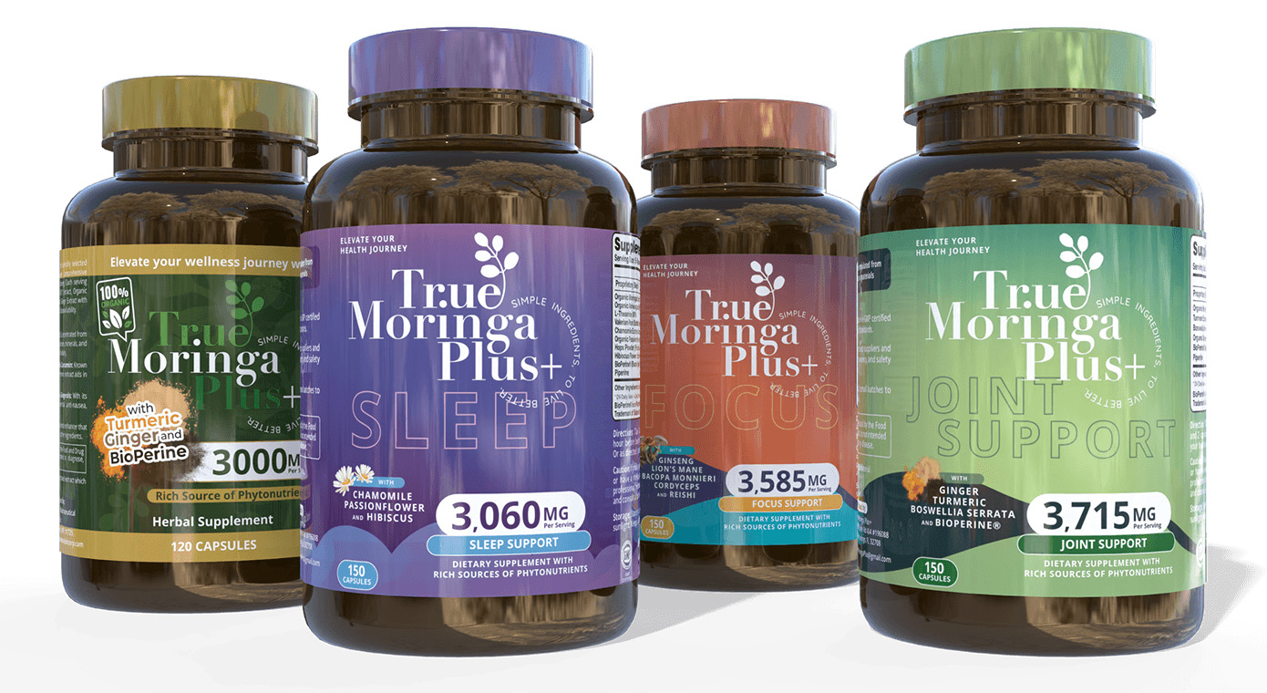
Color Palette: We selected distinct colors for each supplement variant to visually represent their specific benefits and ingredients, enhancing shelf recognition and consumer appeal. For instance, the green label of the “Joint Support” variant echoes the natural ingredients within, such as turmeric and ginger, which are known for their anti-inflammatory properties.
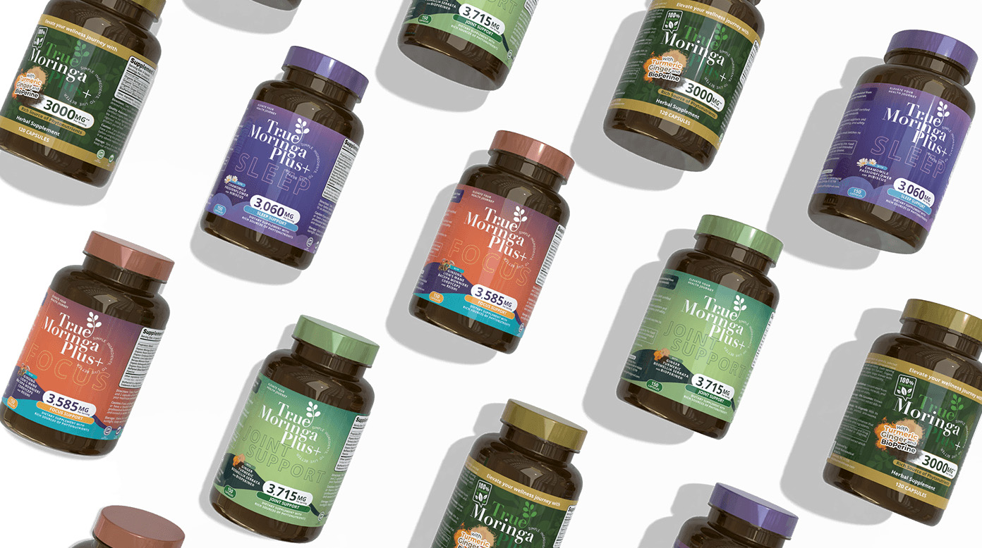
Typography and Hierarchy: Utilizing a bold and clear typeface allowed us to ensure that key information, like the 3000 mg dosage of Turmeric in the “General Health” variant, is immediately noticeable. This choice aids in consumer education and decision-making at the point of purchase. The typeface consistency across variants reinforces brand recognition.
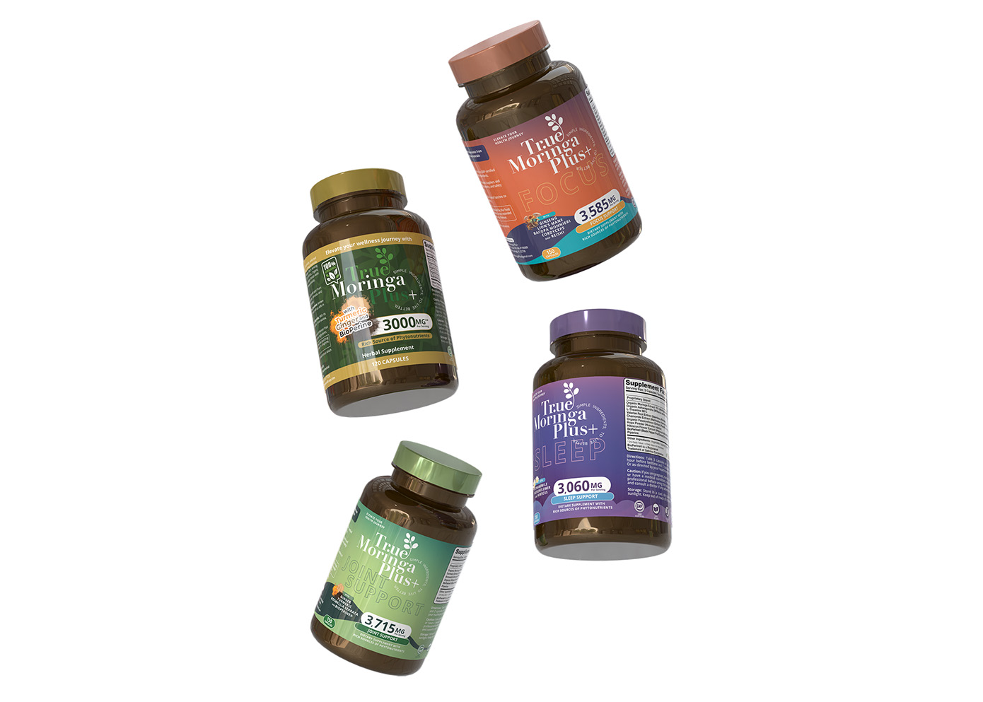
Iconography and Visual Elements: Each bottle features icons that correspond to the health benefits of the supplement, such as sleep improvement or joint support. These icons are strategically placed to create an instant connection with the viewer, making the product’s purpose clear and accessible.
