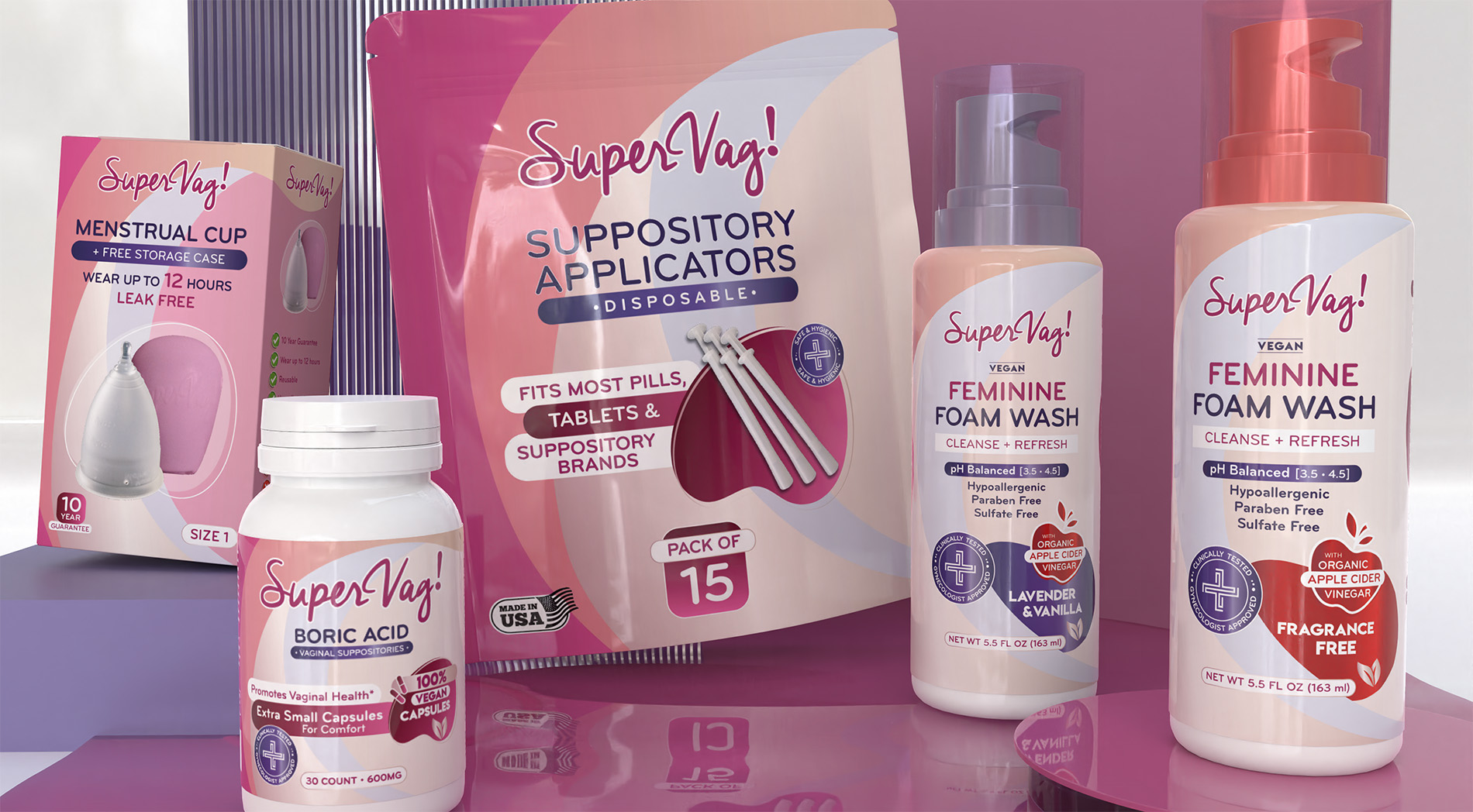
In crafting the “SuperVag!” product line, we wanted to encapsulate a sense of empowerment and wellness in every aspect of the design. Our primary goal was to communicate the product’s unique benefits while maintaining a fresh and appealing aesthetic that resonates with the target audience.
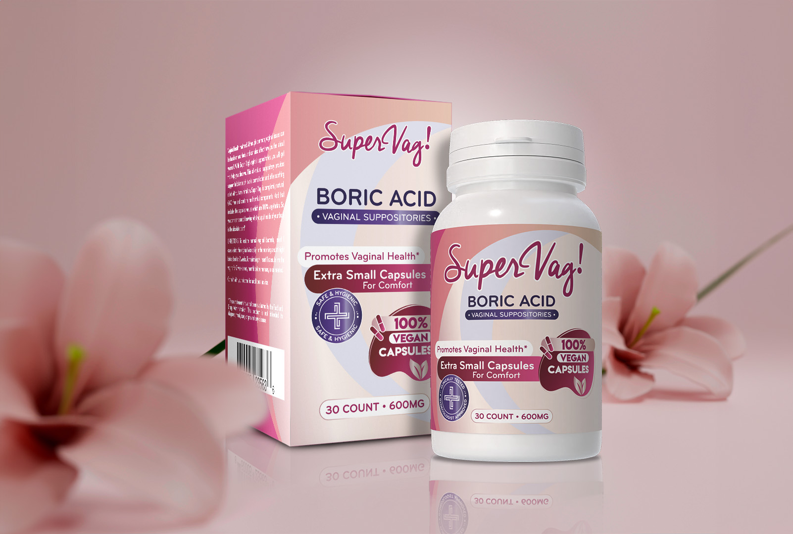
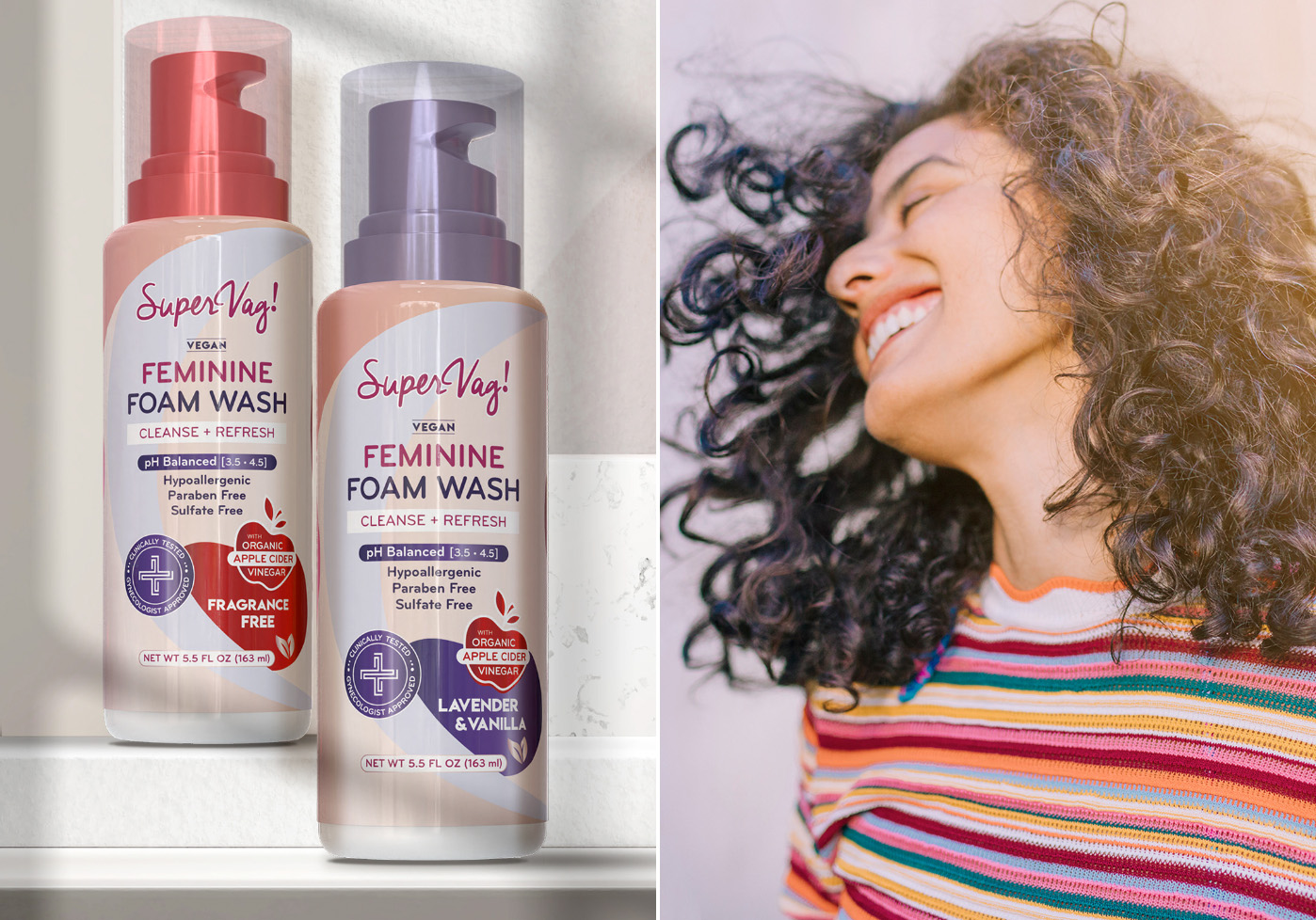
Starting with the color palette, we opted for soft yet vibrant shades that reflect the natural ingredients and gentle formula of the products. For the feminine wash, we chose a gradient of lavender and vanilla tones, which not only highlight the product’s soothing qualities but also give a nod to its fragrance notes. The use of these colors also serves to differentiate the various products within the line, making each item distinctly recognizable.
Typography was another critical element in our design strategy. We selected a modern and clean font that enhances readability while exuding a friendly and approachable vibe. This choice helps to ensure that the essential information, such as the benefits of pH balance and the vegan formulation, is immediately apparent to consumers.
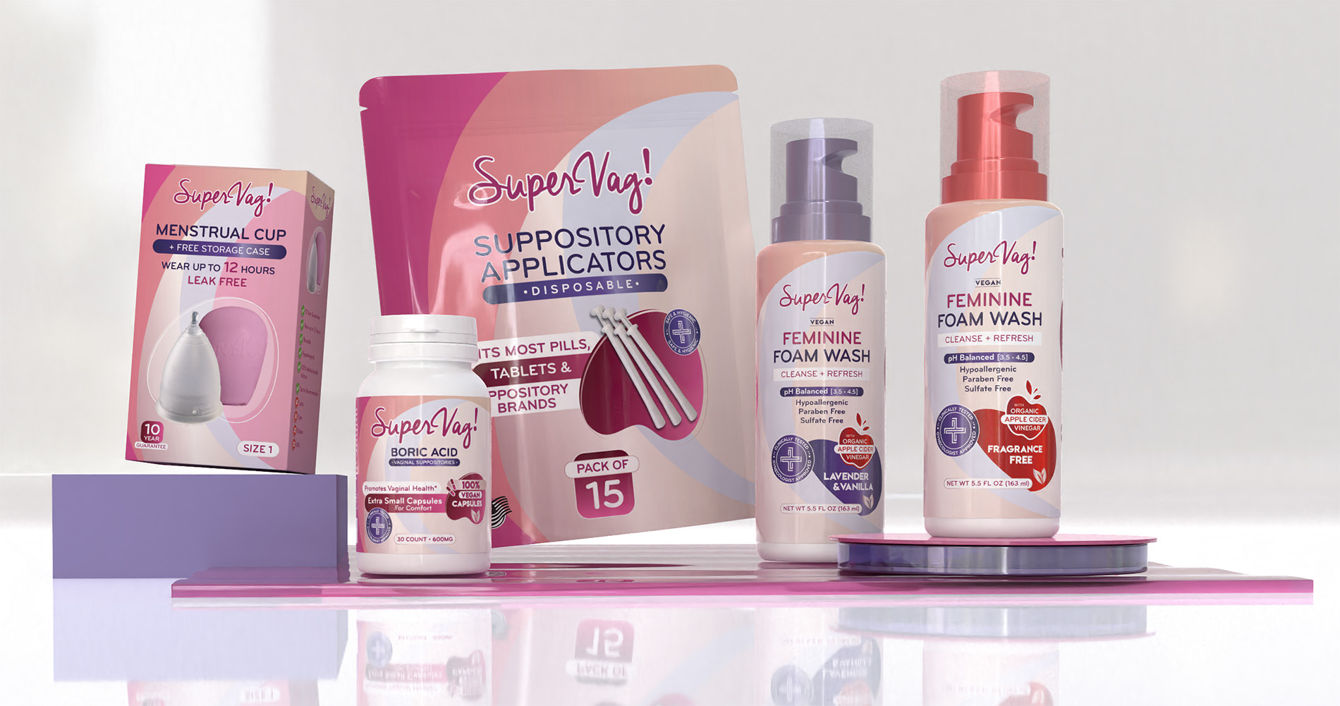
For the packaging, we designed with both aesthetics and functionality in mind. The pump bottles for the foam washes, for example, not only enhance the user experience through ease of use but also contribute to the product’s overall minimalist and elegant presentation. Every design choice, from the layout to the iconography, was made with the intention of creating a cohesive look that aligns with the brand’s values of health, hygiene, and female empowerment. By seamlessly integrating these elements, we aimed to not just attract the eye but also engage the consumer on a deeper level, ensuring they feel confident and empowered in their purchase decision.
