Packaging Design | Castile Soap
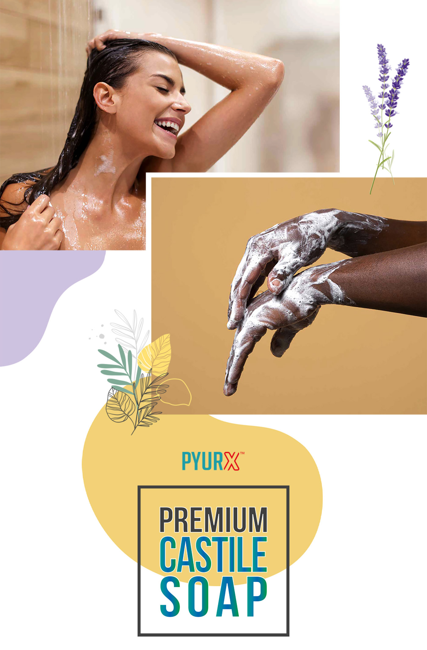
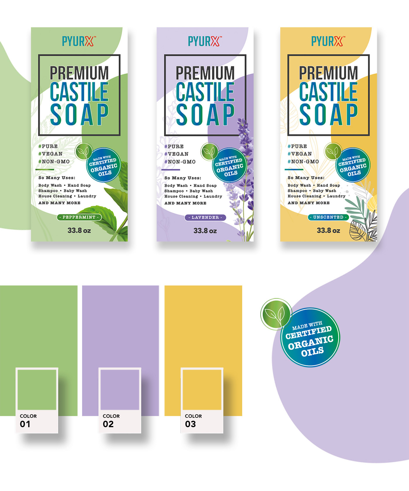
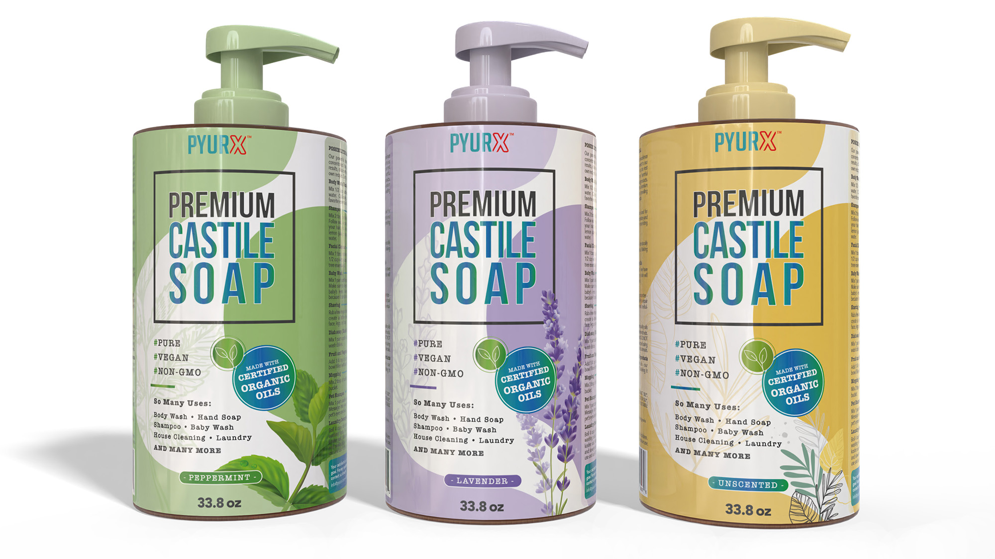
For the PyurX Castile Soap project, we endeavored to design a product line that distinctly communicates the organic, eco-friendly attributes of the soap, ensuring that the packaging resonates with the environmentally conscious consumer. The choice of colors was deliberate; each hue corresponds to the scent and the natural ingredients emphasized in each variant—Peppermint, Lavender, and Unscented. The clean, modern typography balances the organic feel of the visuals, aligning with the brand’s ethos of purity and simplicity.
The visual strategy involved creating a strong connection between the natural ingredients and the user experience, which is why we incorporated images of individuals using the soap, emphasizing its versatility and appeal across diverse demographics. The lavender fields, peppermint leaves, and neutral tones in the images are more than just background; they’re a narrative element that invites the consumer into a sensory experience even before the first use.
The packaging design employs a clear hierarchy in text placement and iconography, ensuring essential information about the soap’s benefits and organic certifications are immediately apparent. This not only aids in consumer decision-making but also enhances the product’s shelf presence against competitors. This design approach aims to create a coherent visual identity that would be easily extendable across potential future product lines, ensuring brand recognition and loyalty.
