Branding & Packaging Design | Lemon UP


Designing the LemonUp Vitamin Gummies branding was a fascinating journey into blending vibrant aesthetics
with the health benefits of lemons. Our goal was to create a product that stands out in the crowded
wellness market, not only through its benefits but also via its visual appeal.
Concept and Design Philosophy:
The inspiration for LemonUp came from the powerful health benefits of lemons.
I wanted to translate the freshness and vitality of lemons into a product that was appealing and easy to consume.
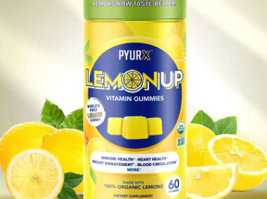
We decided on a vibrant yellow and blue color scheme to evoke feelings of energy and trust.
This palette was used consistently across all packaging and promotional materials to create a strong, recognizable brand identity.
The lemon imagery, a natural choice given the product’s ingredients, was stylized in a bright and clean manner,
reinforcing the purity and organic nature of the gummies.
I wanted to translate the freshness and vitality of lemons into a product that was appealing and easy to consume.
We decided on a vibrant yellow and blue color scheme to evoke feelings of energy and trust.
This palette was used consistently across all packaging and promotional materials to create a strong, recognizable brand identity.
The lemon imagery, a natural choice given the product’s ingredients, was stylized in a bright and clean manner,
reinforcing the purity and organic nature of the gummies.

Typography and Visual Elements:
For typography, I chose modern and clean fonts that are easy to read yet dynamic enough to draw attention.
The packaging design prominently features the lemon graphics and utilizes a circular motif to symbolize
wholeness and health. The layout focuses on clarity and impact, with key benefits and
ingredients clearly highlighted to educate the consumer at a glance.
Photography and Marketing Strategy:
The lifestyle images featuring active, healthy individuals were strategically chosen to align the product with a vibrant,
health-conscious demographic. Every element, from the product photography to the lifestyle shots,
was designed to convey a message of health, vitality, and enjoyment.
The lifestyle images featuring active, healthy individuals were strategically chosen to align the product with a vibrant,
health-conscious demographic. Every element, from the product photography to the lifestyle shots,
was designed to convey a message of health, vitality, and enjoyment.

You may also like: