Branding and Packaging Design | Winni Treats
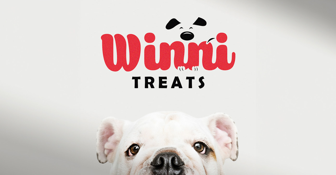
For the Winni Treats branding project, the creative journey began with an in-depth understanding of the client’s vision: a brand that radiates warmth, friendliness, and trust, which are crucial for pet-related products. The design strategy revolved around the creation of a memorable and appealing logo that resonates with both pet owners and their beloved animals.
Concept Development:
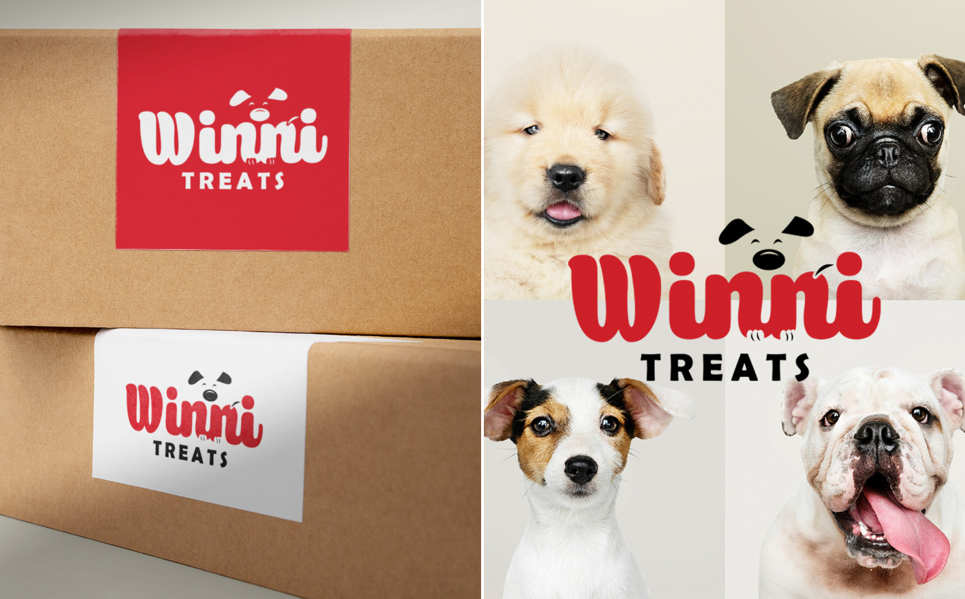
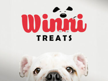
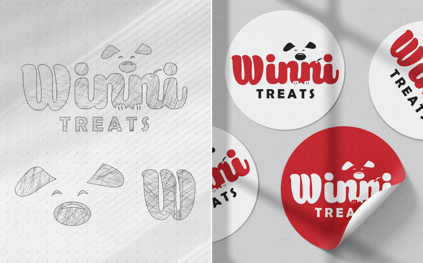
The initial phase involved sketching various concepts that blend the playful characteristics of dogs with a comforting and approachable typography. The final logo portrays a whimsical, cartoonish dog integrated into the text, which helps in creating an immediate emotional connection with the target audience. The dog’s expression is joyful, representing the happiness and satisfaction pets feel when treated with Winni’s products.
The initial phase involved sketching various concepts that blend the playful characteristics of dogs with a comforting and approachable typography. The final logo portrays a whimsical, cartoonish dog integrated into the text, which helps in creating an immediate emotional connection with the target audience. The dog’s expression is joyful, representing the happiness and satisfaction pets feel when treated with Winni’s products.
Color Scheme:
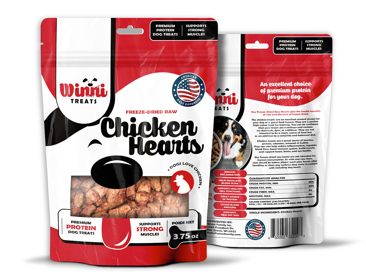
The choice of a vibrant red for the logo is strategic, evoking a sense of passion and love, which are emotions strongly associated with pet owners towards their pets. The color is also visually impactful, ensuring that the brand stands out in a crowded marketplace.
The choice of a vibrant red for the logo is strategic, evoking a sense of passion and love, which are emotions strongly associated with pet owners towards their pets. The color is also visually impactful, ensuring that the brand stands out in a crowded marketplace.
Typography:
For typography, I chose a rounded, soft typeface to complement the logo’s curves and add a friendly, accessible vibe. The typography needed to be legible yet playful, which supports the brand’s aim to appear approachable and fun.
For typography, I chose a rounded, soft typeface to complement the logo’s curves and add a friendly, accessible vibe. The typography needed to be legible yet playful, which supports the brand’s aim to appear approachable and fun.
Overall Experience:
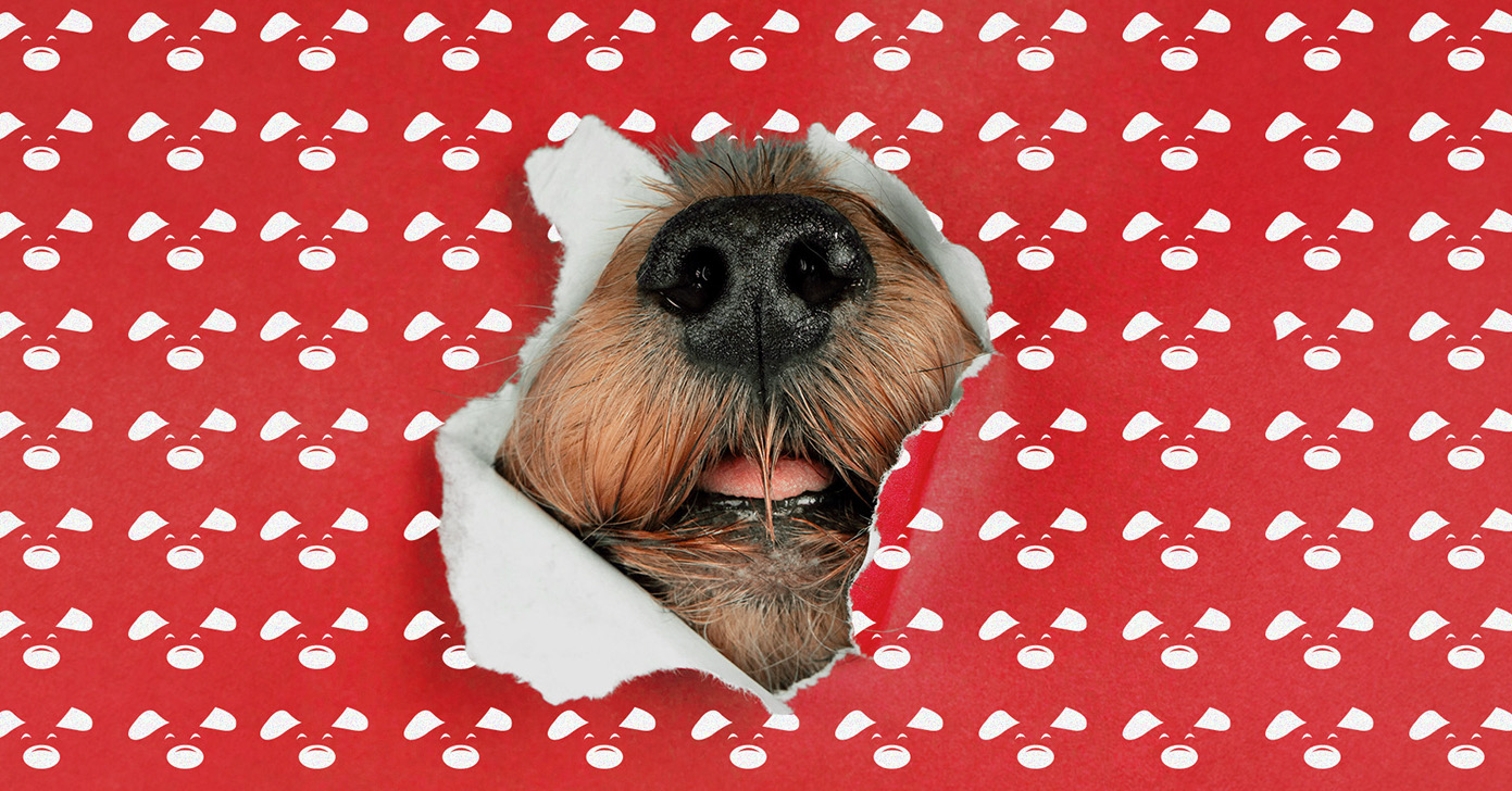
This project was not only about creating a visual identity but also about weaving a story that pet owners can relate to. Each design decision was made with the intent to reflect a nurturing, enthusiastic, and community-focused brand, which Winni Treats aspires to be recognized.
