Brand Identity | RateSaver
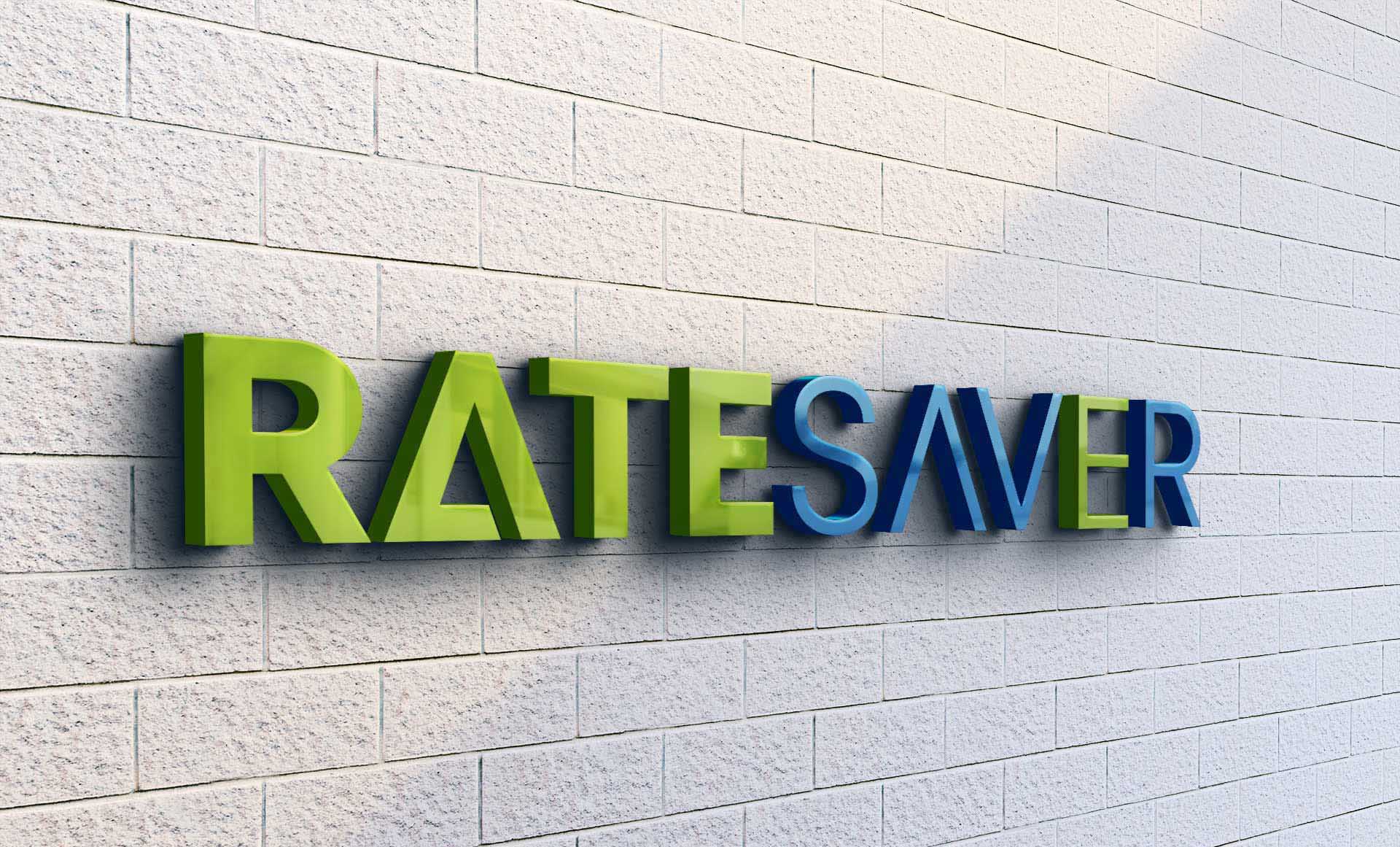
The RateSaver project was a thrilling opportunity to design a brand identity for a financial service that aims to be modern and accessible. The goal was to communicate reliability, efficiency, and innovation through visual design.
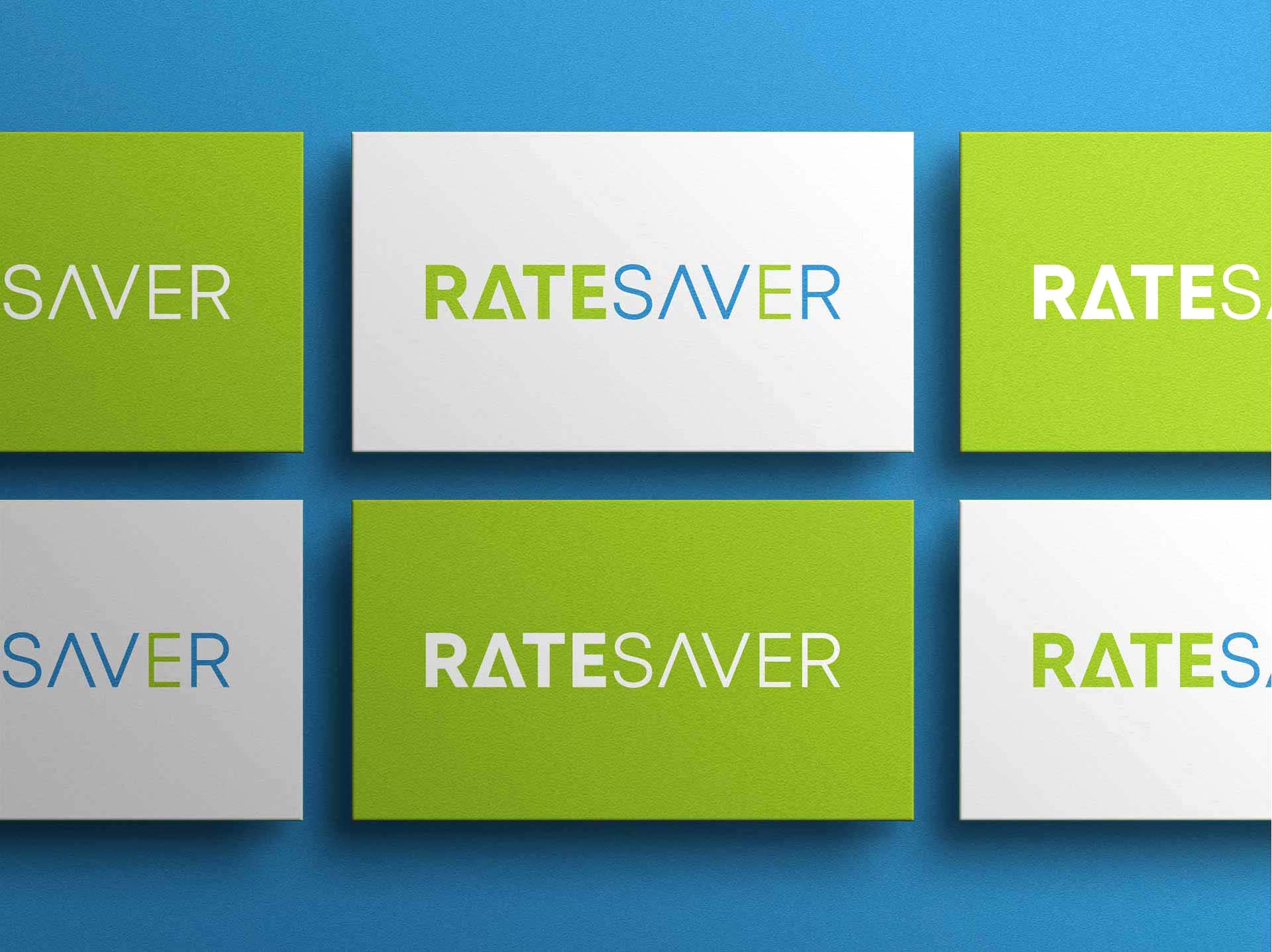
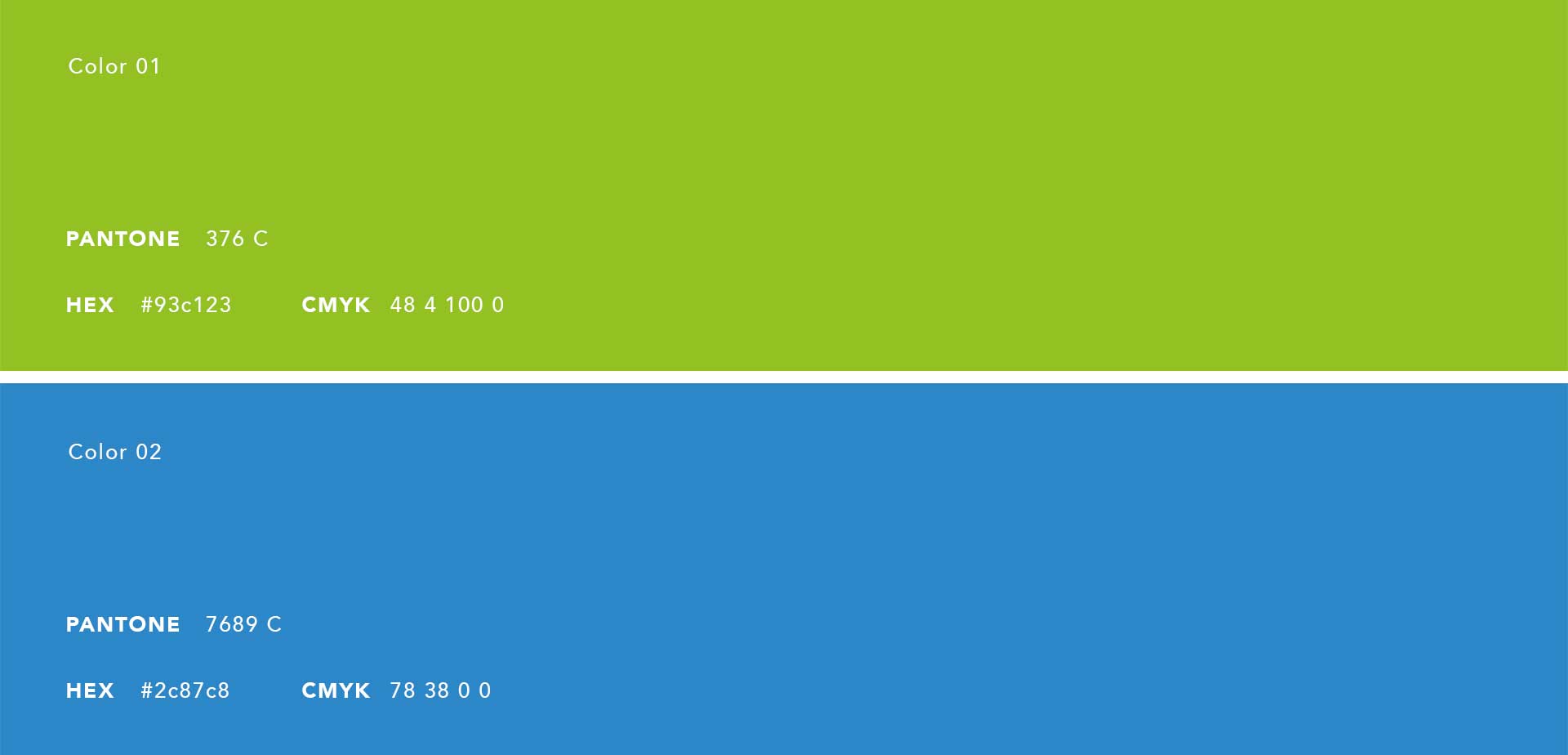
I drew inspiration from the dual ideas of security and savings. This concept guided the use of a strong, confident typeface and a color scheme of vibrant green and deep blue, symbolizing growth and trust. The logo design was kept simple yet striking to ensure it stands out in a competitive financial market, reflecting the brand’s straightforward approach to saving clients money.
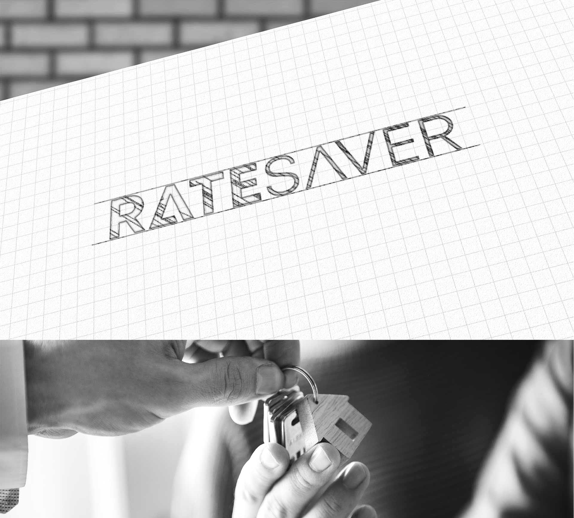
I chose a bold, sans-serif font for the logo to convey strength and stability. The clear, uncluttered lettering represents RateSaver’s transparent and straightforward business model. The juxtaposition of the vibrant green against the blue backdrop in various marketing materials was designed to draw the eye and make the logo memorable.
Simple, clean lines and plenty of white space were used to ensure the message of financial saving and security wasn’t lost in visual clutter. This minimalist approach helped in emphasizing the key messages and enhancing the readability of information across digital and print media.
