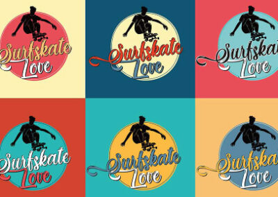
Brand Identity | Surfskate Love
For the “Surfskate Love” project, the design ethos was rooted in capturing the free-spirited essence of surfskate.
The logo’s creative journey began with sketching the dynamic form of a skateboarder in motion, which serves as the emblematic centerpiece. This image was meticulously designed to evoke the fluidity and adrenaline rush associated with these sports.
The choice of a vibrant color palette, including a rich teal and a lively yellow, was intentional to reflect the youthful and energetic vibe typical of the surfskate communities.
These colors not only grab attention but also reinforce the brand’s energetic personality.


For the textual component, we opted for a whimsical, flowing script that complements the movement of the logo’s central figure, emphasizing the “love” in “Surfskate Love”. This typography choice was meant to add a touch of elegance and a personal feel, inviting enthusiasts to connect with the brand on an emotional level.
Each promotional material, whether it’s the apparel, skateboards, or accessories like water bottles, was thoughtfully crafted to ensure brand cohesion. The incorporation of the logo across various backgrounds and products demonstrates versatility and wide appeal, aiming to resonate with a diverse audience of enthusiasts.
This approach not only solidified the brand’s identity but also ensured that the passion for surfskate culture was palpable in every design detail. The integration of these elements represents a harmonious blend of sport and artistry, which is at the heart of the “Surfskate Love” brand.
You may also like: