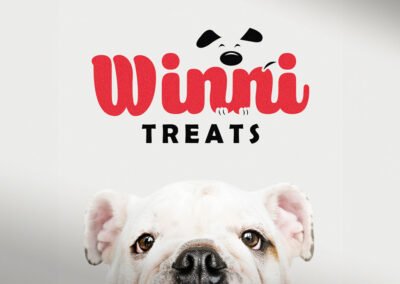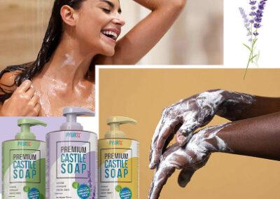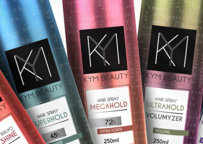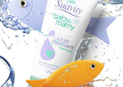
Packaging Design | Itallian Color

The creative process for developing the branding for Italian Hairtech’s product line focused on embodying elegance and modernity. Each element was carefully chosen to reflect the sophistication and quality of the products. The color palette, dominated by sleek greys and accented with the vibrant Italian tricolor, conveys a sense of professional-grade, high-performance products. This is further emphasized by the choice of clean, minimalist typography, which ensures the product specifications are easily readable while maintaining a high-end look.
The packaging design itself was crafted to be as functional as it is aesthetically pleasing, with a structured form that not only stands out on shelves but also communicates the robustness of the products within. For promotional visuals, we employed a backdrop that complements the product design, ensuring that the products themselves remain the focal point, thus enhancing the overall brand recognition.

Innovative features like the “dust-free” claim on the bleach powder and the protective ingredients in the hair color tubes are highlighted to appeal to the informed professional, ensuring they understand the product benefits at a glance. Each image used in the marketing materials, from press kits to online banners, is designed to echo the brand’s commitment to quality and innovation in the beauty industry.
This approach not only ensures visual coherence across all platforms but also supports the brand’s identity as a leader in professional hair care solutions, aiming to inspire trust and preference among both new and returning customers.


You may also like: