Packaging Design | Energy Drink

For the “Machin” project, the packaging was designed with a focus on appealing to the energetic and vibrant demographic targeted by the product. The choice of a bold black backdrop with contrasting bright yellow elements aims to catch the eye instantly, creating a dynamic, youthful feel that’s consistent with the product’s brand identity—energy and vitality.
The typography and graphics are sharp, using angular designs that suggest speed and efficiency, resonating with users looking for a quick energy boost. The layout of the product information is meticulously organized to ensure clarity and easy readability, which is crucial for conveying the essential details quickly and effectively.

The use of icons to indicate no sugar, calories, and the inclusion of caffeine and taurine is strategically placed for immediate understanding and assurance to health-conscious consumers. This design choice aligns with the modern trend of transparent and straightforward labeling.
Every aspect of this design—from the color scheme to the typographic choices—was carefully considered to ensure that the product stands out on shelves, aligning with consumer expectations for health supplements that are both effective and easy to use.

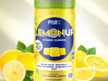
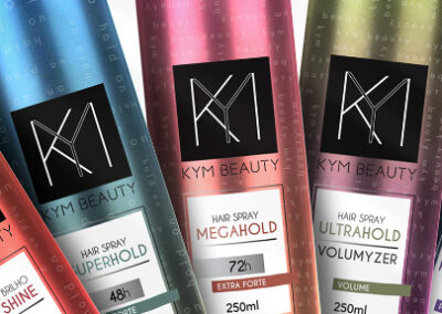
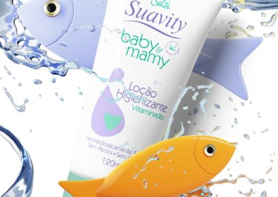
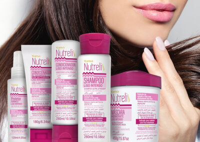
You may also like: